A good-looking eLearning course is not a guarantee of its instructional effectiveness. Think of all those magazines with glossy covers that you flip over expectantly only to find that the pages are filled with trash. Unfortunately, many course developers have no clue of how visual design can increase (or decrease) learnability of the material.
Think back to your own learning experiences to understand cognitive load. There was always some subject in school that was, by nature, difficult to comprehend—a topic with a high intrinsic cognitive load. Sometimes text books, with sketchy or roundabout explanations and unrelated analogies, made it difficult for you to make sense of the content. These books increased the extraneous cognitive load and were ineffective.
But almost all of us have been taught by some great teachers who simplified challenging learning matter with diagrams, charts, and demonstrations. They helped us learn and master the subject by reducing the extraneous cognitive load.
As an instructional designer, the onus is on you to create courses that reduce the extraneous cognitive load, so learners can devote their mental energies to learning the complex subject matter. Good eLearning design can help you fulfill this end.
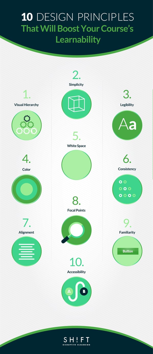
Make sure you apply these ten eLearning design principles the next time you create a course with a high learnability quotient:
Why do you think books and newspapers use headlines, sub-headlines, and paragraphs to distinguish text? That’s because the writer wants us to read the content in a particular order: first the headline, then the sub-headline, and then the paragraphs. The writer doesn’t plunk down a block of text and leave us wondering which portion of the content is more important.
A strong visual hierarchy tweaks color, font and image size, typeface, alignment, and placement of the various elements on screen to create a viewing order for learners. This viewing order is based on the relative importance of the different pieces of content. This hierarchy not only makes the content scannable but also indicates to learners what information is critical and which is peripheral.
The placement of the elements on each page should flow naturally from one to the next in a progression that lends itself to the content you're teaching. Images and graphics should be oriented in a way that directs the reader's attention inward and onward, never away from the screen or your content.
We will cover visual hierarchy in greater detail in the next post. Watch out for it.
Read more: Design Tools to Build Visual Hierarchy in eLearning
We all have experience with clutter. When clutter takes over our desks, drawers, wardrobes, and rooms, we spend hours hunting for stuff that we need. It is a frustrating experience. Your learners experience the same feelings of frustration and irritation when they have to wade through the clutter in your courses. They avoid reading what’s on the screen when they are confused and don’t know how to make sense of the clutter.
Simplification is an art.The goal is to create a distraction-free design that does not look boring. Furthermore, you have to make sure that you don’t sacrifice meaning to achieve simplicity.
Here are a few pointers to help you achieve this delicate balance:
- Cut the fluff. Figure out what's most important, provide the learner with an avenue to access the additional information and cut everything superfluous. Inessentials crowd the working memory of the learner, and he has to process and store them. He thus cannot optimize the power of the working memory to learn what is essential.
- Break up text into titles and paragraphs and if possible, display content in the form of lists. Large chunks of text overwhelm learners quickly. Many learners are put off just by the sight of a wall of text.
- Be selective, prioritize. Choose and include only those media elements that add to the instructional value of the course.
- Adopt the less-is-more approach for colors and fonts too. Keep it simple by choosing 2-3 of each.
Read more: How To Avoid Designing Cluttered eLearning Screens
A focal point is a primary area of interest that attracts learners as soon as they arrive on the page and then draws them gradually into the content presented on the screen. The focal point is the most critical piece of content, so it should be compelling. Without this central element, the learner’s attention gets scattered easily as the eyes move all over the screen without resting on anything particular. And when he finds nothing riveting, he moves on to the next screen.
Here’s what you should keep in mind when creating a focal point for a screen:
- Emphasize one important learning concept per screen and make it your focal point.
- Your focal point can express the most important piece of content on a screen through various means: as an idea presented in a few words, an image, an emotion depicted through a story, or a bunch of statistics arranged in an infographic.
- Create a design flow where the focal point of interest serves as the anchor that leads attention to the secondary and tertiary pieces of content.
Focus is not one of our virtues. We have abysmally low attention spans, and according to one study, people at work tend to shift focus from one task to another as many as 20 times in an hour. Social media and the easy availability of on-demand services do not help matters either.
A screen that is choc-a-block with elements is not easy to focus on. Every element seems to scream for your attention. Your eyes waver and your mind cannot rest on any one element at one time.
Use white space to reduce clutter and provide a visual breather to learners by balancing out the busier portions of the screen. White space is empty space inside, outside, and around the content that is calming and lets the learner focus. Furthermore, white space provides clarity and aids learnability.
Here are some tips on how to use white space to create immersive learning experiences:
- White space is not always white. It just denotes an empty space that contains no element; it can be a patch of color as well.
- Separate elements using white space to make them stand out and be more readable to learners.
- Textual content should ideally occupy 25-40 percent of the total screen space.
- Too much white space leaves learners with no visual focal point, and they may feel dissociated from the content.
Would you carry on reading on Kindle if you can’t make out the letters of the book? No, you will adjust the brightness of the screen or increase the font size. Would you carry on watching a movie if you can’t make out what’s happening on screen? No, you will tinker with the controls of the TV till the images are crystal clear.
Your learners don’t have a way to change how the course content is showing up on their screen. So they will leave the course if they can’t read what’s on screen. Use easy-to-read typefaces. Here are some pointers:
- Sans serif fonts are better on web.
- You can be creative with the typefaces. But remember some fancy fonts, especially those with swirls and twirls, are hard to read. Usually, the Sans Serif fonts are easier to make out than Serif fonts.
- Use a color scheme with contrasting colors to bring out the fonts and make them highly legible.
- Be careful with light typefaces. Read this guide.
- Use a typeface that is legible whatever the device the learner views the course on. The ideal font size for reading online is 16 pixels.
- You can use contrasting fonts to liven up the screen, but don’t go overboard. Use not more than three typefaces in not more than three point sizes to keep the screen clutter-free.
- You can use color to emphasize important pieces of content instead of introducing a new typeface.
Visuals are powerful learning tools. The human brain is wired to process images faster than text. Learners comprehend content better and quicker when you supplement textual content with images than when you just use large blocks of text. But remember the following rules:
- Graphics in your eLearning should match. Use images with similar styles to create a consistent, harmonious look throughout the course.
- Use photographs that have been shot in similar lighting conditions; hazy images and hi-resolution pictures used together in a single course smacks of unprofessionalism.
- Make sure that there is an overarching visual theme throughout the course.This visual theme of your eLearning course should carry through from page to page. Getting too creative can end up distracting the reader from the content.
- Also, watch out for heading sizes, font choices, color scheme, button styles, and spacing. Everything must be in harmony.
Read more: 5 Methods to Achieve Visual Consistency in eLearning
Think of the supermarket. Here the food items are grouped together and arranged along the food aisle. Similarly, gardening tools and cleaning equipment are displayed in separate aisles. The aisles are prominently marked. Now imagine what will happen if similar items in the supermarket are not arranged in separate aisles; you will never find what you are looking for! This is what alignment does to your eLearning courses.
Alignment makes it easy for the learner to scan and read the content and make sense of it. Good alignment reduces clutter and makes a course more organized.
Below are some pointers to help you create an intuitive visual flow:
- Elements placed on the same vertical or horizontal plane are perceived to have similar properties. So, align elements with similar properties in a single column or row.
- Ensure that all the elements in one group are aligned properly. This eliminates confusion like “Does this entry belong to this table? Is this item in this column?
- It should always be clear what text is associated with which images.
A beautiful and novel design is always a treat for sore eyes, especially those that are bombarded by dull corporate presentations and staid white papers. But a wow design that increases cognitive load and makes the learning process an uphill climb defeats the purpose of an eLearning course. Novelty is appealing as long as it does not make the learner work hard to make sense of the content. Sensible adult learners usually prefer the dull-but-familiar to the delightful-to-look-at-but-maddeningly-difficult-to-understand.
Familiarity is comforting. When learners come across familiar presentation styles, icons, and navigational structure, they feel confident of sailing through the course smoothly. Novelty is often repulsive because the unknown is scary.
Now that you are convinced that familiarity is comforting don’t try anything fancy with the navigation. You might want to create a quirky navigational structure, but if it does not aid to the instructional effectiveness of the course, why should you tax the learners’ brains?
The primary goal of navigation is to make information easily accessible. Learners should be able to move back and forth across screens and skip content easily. And this is it. So don’t vex them with hard-to-find or non-existent Back and Next buttons, pop-ups that have no Close buttons, and links that divert them to external resources.
Color is a powerful graphic tool. You can create interest, rivet attention, emphasize content, and establish visual hierarchy just by using colors and without inserting additional graphic elements. For instance, a minimalist design reduces clutter.
Here are some pointers to help you make powerful statements with colors:
- Don’t strive for minimalism by sacrificing usability. Use a color scheme that presents enough contrast to make your course legible.
- You can make your courses livelier by using bright, vibrant colors. In such instances, use monochromatic color schemes to prevent the colors from clashing.
- Darker colors tend to attract attention first. Use a mix of dark and light colors that balance out one another and also create visual hierarchy.
- Use accent colors to draw attention to critical information.
Read more: The Complete Guide to Color Combinations in eLearning
Although there are several more principles of great design, the ten mentioned above will help you create effective eLearning courses that achieve their objectives and leave learners satisfied. Make sure you apply them the next time you design an eLearning course.