
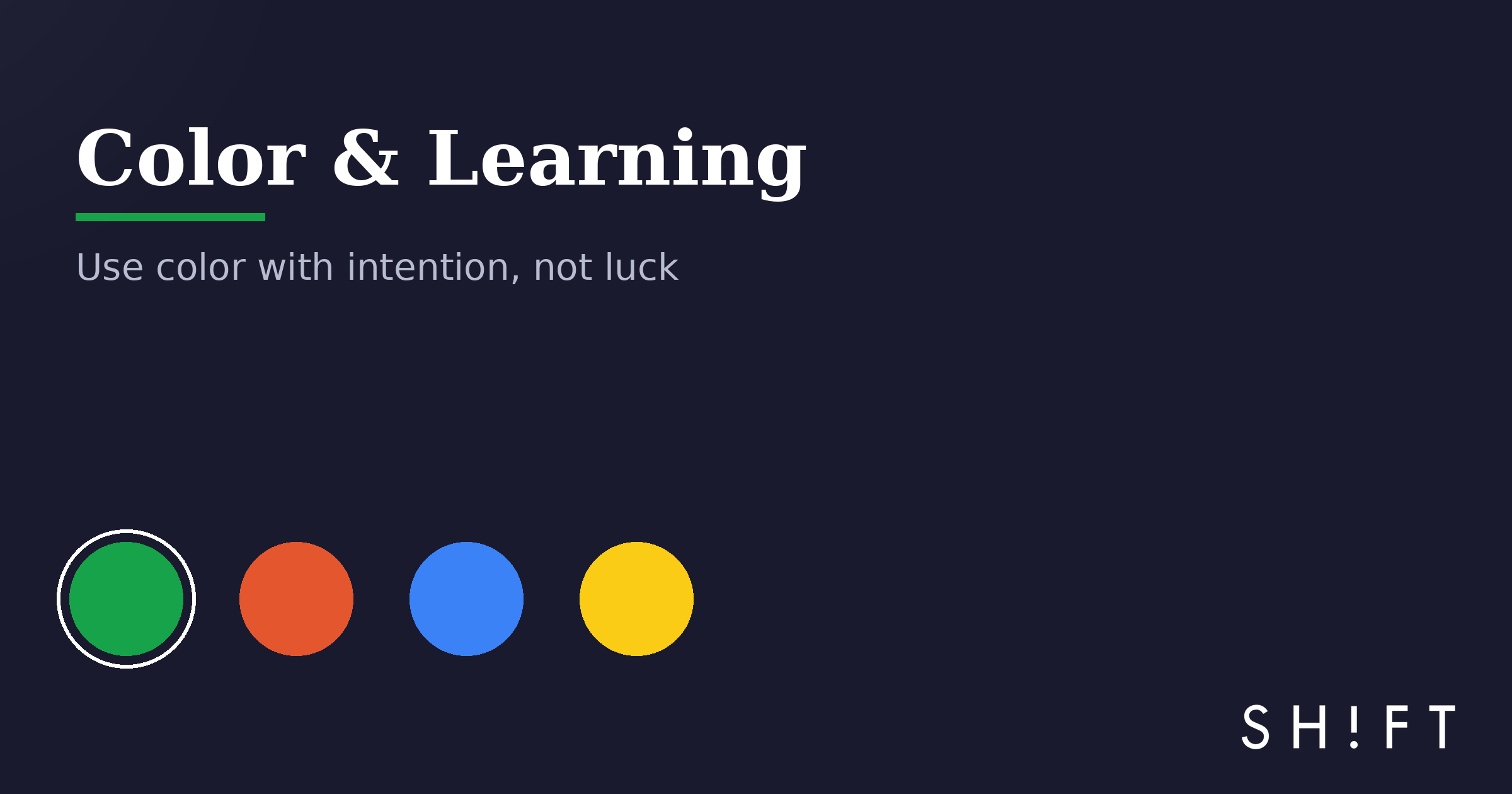
Color is not decoration. In a course, it is a set of instructions you give the learner's eyes: look here, this matters, these two things belong together.
Our earlier article on how colors influence learning is still a favorite. This update focuses on the practical side: how to actually choose and use color in your next course — without guessing.
Rule 1: One job per color
Pick a small palette and give each color a job. For example: one neutral for backgrounds, one dark tone for text, one accent for "this is important," and one color reserved for feedback.
Then never change the jobs. If green means "correct" on screen 3, green cannot mean "click me" on screen 12. Consistency is what lets learners stop thinking about the interface and think about the content.
Rule 2: Use contrast to point, not to shout
The eye goes to the thing that looks different. That is your most powerful tool — and the easiest to ruin. If everything is bright, nothing stands out.
Keep most of each screen calm and quiet. Spend your accent color on the one element you want people to notice: the key term, the button, the number that matters.
Rule 3: Design for every pair of eyes
A meaningful share of people see color differently — red/green confusion is the most common. Two simple habits protect them:
- Never let color be the only signal. Pair it with an icon, a label, or a shape ("✓ Correct" in green, not just green).
- Check that text has strong contrast against its background. If you squint and the text disappears, fix it.
Rule 4: Match the mood to the task
Cool, muted tones tend to read as calm and focused — a good default for content-heavy screens. Warm accents read as energetic — useful for calls to action and moments of celebration. Neither is "better." What matters is matching the feeling of the screen to what you want the learner to do on it.
See it for yourself
Here is the same little course screen in four palettes. Watch how the mood — and where your eye lands — changes with each click.
Module 3
Handling a difficult customer call
In this lesson you will practice the three steps: listen fully, acknowledge the problem, and offer one clear next action.
Start practiceTip: notice how "Everything loud" makes it harder to find the button — proof that more color means less direction.
Start small
You don't need a design degree. Pick four colors, give each one a job, protect contrast, and stay consistent. Do that and your courses will instantly look — and teach — better.
And if you'd rather have professionals and smart tools handle the visual side while you focus on the message, that's what SHIFT's design and development team does every day, on courses used around the world. Let's talk about yours.
Ready to transform your corporate training?
See real results from companies that train with SHIFT — or talk to our team.