

What do you think is the first thing people would remember about your eLearning course’s screen, if suddenly asked?
It should be no wonder that what they will put design on top of the list. But why does this happen?
Although you may think that the information provided is much more important than the design, people are visual creatures, and they easily associate memories with colors, texture and images. If you want your eLearning course to create a long lasting impression, do not neglect the importance of an impactful design.
Test one or all of these ideas to keep your eLearning courses looking fresh, engaging, and innovative.
1. Vibrant blue and orange, united by flat design
You can give your course design a modern feel by featuring flat design with minimal elements. This will make your content completely transparent and free from distractions.
In your next eLearning course, consider:
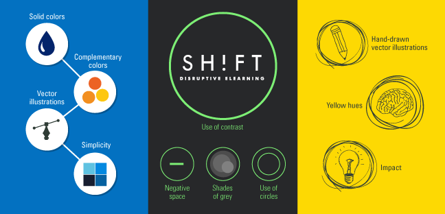
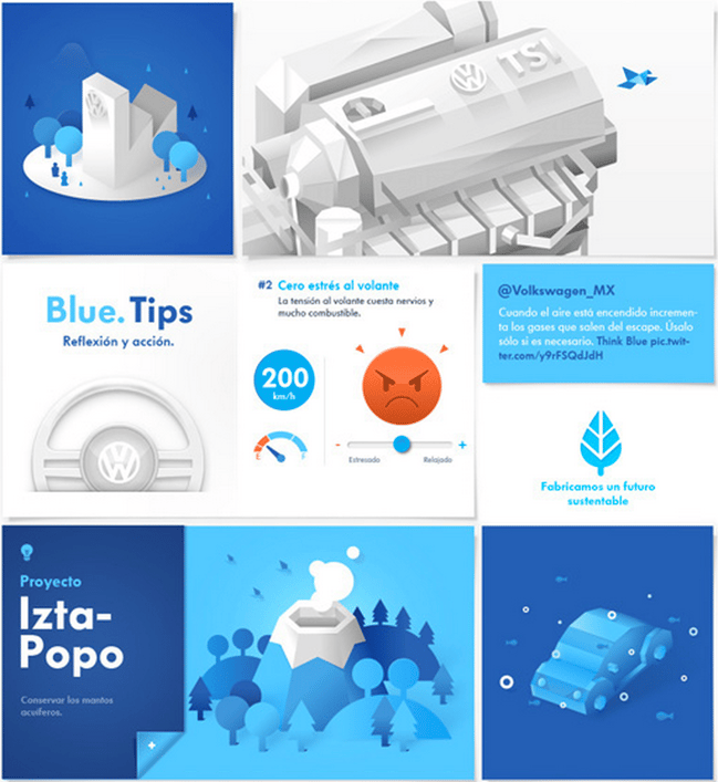
Solid colors: Blue is a common choice for eLearning courses, because it is considered conservative and peaceful in the same time. In other words, nothing spells professionalism better than solid blue tones.
Complementary colors: When you are choosing the color palette, do not forget that every color should be balanced by its counterpart. For blue, orange is the smartest choice, because it creates a clean, yet impactful effect that cannot be acquired by any other color in combination with blue.
Vector illustrations: The best way of acquiring an appealing flat design is by using vector illustrations. Their clean shapes will not detract from the message.
Simplicity: Aim for simplicity in everything, from buttons to shapes, to the typography used to deliver the message.
Example:
Volkswagen - Think Blue. Website
Download: A free flat UI kit that you may use in your own project.
2. Minimalist design inspired by nature
Another trend taking flight in graphic design is the (almost) overuse of negative space. Websites and landing pages inspired by pictures taken from nature, but artificially enhanced to create more impact are quite popular right now.
In your next eLearning course, consider using simple colors, little to no gradients and shades of grey.
Plenty of white space: White space is often called negative space because it lets the other elements speak louder for themselves. Any minimalist design should aspire at using a lot of negative space.
Shades of grey: Grey is essential for extracting the essence of a minimalist design. Vary the shades and combine them with black and white for an attention grabbing effect.
Use of circles: These mundane shapes seem to be the best choice for any design that wants to come across as unpretentious, yet professional looking.
Use of contrast: The goal of your eLearning course is to draw attention, while infusing the learner with energy. Some stunning contrasts, such as neon lights against neutral colors, can create the exact effect you are after.
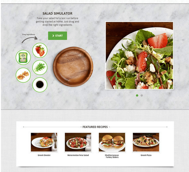
Example:
Athenos Website
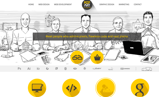
3. Hand drawn sketches and yellow hues take a stand
For eLearning designers that want to bring individuality, personality and appeal to their courses, the new trend of hand drawn sketches, accompanied by the overuse of yellow hues, seem to be quite effective. This trend should be used by eLearning courses that focus on promoting creativity. Remember that those watching the course are interested in finding meaning and inspiration to change certain behaviors, and this design style will convey this exact message.
So, don’t be afraid, add a personal touch to your eLearning course with hand drawn sketches and illustrations.
Also consider:
Hand-drawn vector illustrations: Hand drawn vectors and illustrations can be interpreted by learners as friendly and approachable, contrary to the serious corporate design. There are plenty of online resources from where you can purchase readymade illustrations to use in your presentations.
Yellow hues: According to experts, yellow is an attention grabbing color and it also seems to stimulate memory. If points of your course are marked in yellow, learners will more likely remember those specific points over others.
Create Impact: Yellow is also a more unconventional color, so don’t forget to use it where it is needed. For instance, it is ideal to balance yellow against a conservative looking background, to send the message that the design is aimed at fueling the learner’s imagination and creativity.
Example:
Download:

