How would you like it if vegetables at the supermarket were stocked with meat or milk? You wouldn’t find the produce in the first place.
There’s a reason why the Table of Contents is placed within the first few pages of every book. There’s a reason why the streetlights are not tucked away amidst a maze of store signs.
The reason is usability or how easy or difficult it is to find your way through a user interface. And judging by how difficult it is to find houses in certain streets or make your way through software, it seems that it is easy to goof up UX design.
Bad usability can inhibit your learners from learning what they need from a course. So, to avoid this, here are 3 tips you can use to create killer eLearning designs:

Tip #1. Avoid Low-contrast Text
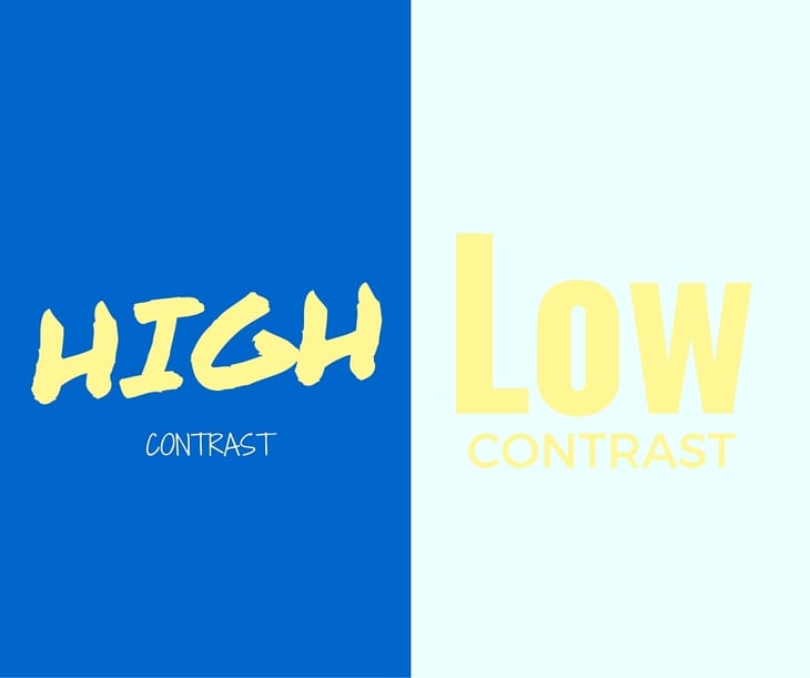
According to research by NNGroup, low contrast text is bad for usability. Just to make sure we're all on the same page, low-contrast text refers to the contrast between on-screen text and its background.
Here’s why you should avoid this bad practice in your eLearning courses:
- It impairs legibility. Trying to read low-contrast text strains the eye. Your learners will soon give up if they have to peer and squint to read the text on screen. Accessibility issues are real and rampant; keep your visually-challenged learners in mind when designing for usability.
- It impairs discoverability. Low-contrast text is hard to spot or make out on the screen. Instructional effectiveness and usability suffer and cognitive load increases when learners fail to notice a search icon or a link, especially one that is placed in an unconventional position.
- It erodes learner confidence. This is the “fine-print” hangover. When you make text difficult to read, the learner immediately feels as if you have something to hide from him. He loses confidence in you and what you have to say.
- It impairs reading on mobile devices. Even high-contrast text is sometimes difficult to read on mobile devices when you are out in the sun. So, don’t even bother to place low-contrast text on your mobile courses.
Make sure that you get the contrast ratio right by calculating and comparing the relative luminance of various text and background color combinations. Use online calculators like this tool or this. Ensure that you create the guidelines early in the design process for all new designs.

Tip #2. Ensure High Contrast for Text-Over-Images
According to findings from eye-tracking research studies, people are more attracted to and spend more time browsing photographs with information printed on them than just images or plain text. Images bring on positive visceral response. The text-over-images design straddles both worlds; it gives learners a hook in the form of an image and also gives relevance to the image by placing textual information over it.
However, beware of low contrast between text and the background image. Nielsen Norman Group suggests these best practices:
- Keep in mind accessibility requirements for text-over-image designs. The contrast ratio should be at least 4.5:1 or 3:1 if you choose to use large 14-point bold or 18-point font size.
- Place the text over a patch of color to make it stand out from the image.
- Overlay the image to create a slightly darker background over which the lighter-colored or brighter text will stand out.

Tip #3. Encourage Scrolling (People Do Scroll!)
It is now more likely that the average learner will access your course on his mobile device than on a desktop PC. And contrary to popular opinion, people are not averse to scrolling. In fact, they prefer it to having a large chunk of content spread over multiple screens that they have to click, click, and click to access.
The following are the golden rules of an effective scrolling design in eLearning:
- The “fold” is still relevant, but you don’t have to cram every piece of content above the fold to get noticed. According to studies published in Time Magazine in 2014, “66% of attention on a normal media page is spent below the fold.”
-
What you have above the fold will compel your learners to explore what is below it or make them turn away from your course. So make sure that you put compelling content above the fold. Introduce a story or use an image as the hook.
-
Use the above-the-fold space to provide just a snippet of the actual content. According to research, less content above the fold works as a teaser and intrigues learners to make them scroll down. Besides, when learners are not overwhelmed by the content, they are encouraged to explore.
Here are some more scrolling best practices to help you achieve killer usability in eLearning.
Also read this article: The Fold Manifesto: Why the Page Fold Still Matters


