 Four Questions You Should Ask to Help You Think Like a Learner">
Creating an eLearning course is a creative process. As an instructional designer, you need to be come up with designs and ideas that wow your audience. But in trying to be innovative, we often end up creating courses that wow us but fail to inspire the audience. We feel elated at having used a novel technology but fail to impress the learners. We think we have got across a message effectively but the learners leave our course feeling unfulfilled and without solutions to their problems. There is obviously a gap somewhere!
Yes, the gap is in the thinking processes. We, as instructional designers, tend to think differently than the learners.
But you want to create a course that not only impresses the learners but also helps them solve their problems. You want to create a course that convinces the learners to change their thoughts and behavioral patterns. You want to create a course that is memorable and enlightening. To create a course that sticks and connects with your audience, you have to step into their shoes, delve into their minds, and deliver what they need.
Ask yourself these questions to understand what the learner expects from your course:
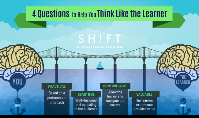
Question #1: Why would they want to see and read through a screen?
Remember your learners are busy people. They have made the time to take the course in the hope that it will solve their problems or empower them to figure out the solutions themselves. They believe that your course will teach them skills that will help them further their careers and realize their professional goals. You HAVE to make every screen count!
Before you design a screen, ask yourself what value it will provide to the learner. Keep the following tips in mind:
- Create a screen that contains ONLY relevant information.
- Create a screen that contains key takeaways for the learner.
- Create a screen where the content fulfills at least one learning objective.
- Create a screen where the critical pieces of information are easily accessible.
When designing a screen for your course, keep in mind this golden rule proposed by eLearning guru Marc Rosenberg: eLearning courses should be based on a performance-centered approach instead of following a task-centric approach. Your corporate learners are application- and results-driven individuals who demand takeaways from your course that they can apply when they get back to their desks; they are not interested in nice-to-know information.
Question #2: Does the course look good?
Why do chefs take the pain to garnish their dishes? Can a sprig of rosemary or a swirl of chocolate sauce make the food taste better? It cannot.
Why do perfumes come in quirkily-shaped bottles? Does the shape of the bottle make the fragrance more enticing? It does not.
So why do manufacturers spend oodles on packaging? Because customers tend to form their first impressions about a product from its packaging.
The adage "Beauty is only skin deep" is not always true when it comes designing eLearning courses. It is true that you cannot get away with a fluffy and pretty course, but you will still have to present it in an attractive package that hooks the audience and keeps up their interest levels.
Of course, "attractive" does not mean swirling motifs, cursive text, and pastel shades. The following are the components of a well-designed and visually appealing course:
- Well-organized on-screen elements
- High-resolution images and videos
- Ample white space on the screen
- Background and text colors that facilitate readability
- Prominent navigational features
If your course looks good, the learners get the impression that you care to give them a pleasant experience.
Question #3: Can they control the course and find their way around it?
Adult corporate learners are way past their school days when they had to sit through lectures. Now they resent learning that is thrust down their throats; they want to engage with the course and feel that they are in control of the learning process. Learners need to feel control over their actions; therefore, you have to create an interface that gives them the freedom to navigate around the course. Keep the following in mind when designing a course:
- Structure and sequence content so that learners are presented with instructional matter that is in sync with their learning styles. For instance, present simple concepts before dealing with more complex ideas and show the results of an action undertaken by the learner.
- Allow learners to jump screens and move forward.
- Use menus and sub-menus and signposts to allow learners to return to a screen or access content randomly.
- Let learners retake assessments.
- Create an intuitive user interface where the learners don't have to stumble around trying to figure out how to proceed to the next screen or how to close a pop-up.
Question #4: Was the learning experience worthwhile?
Does your course provide value? Would the learners take your course if it was not mandated by their companies? Was it worth your time to create the course? Will the learners retain what they learned? Was taking the course smooth sailing all the way or did the learners feel irritated at being made to hunt around for content? Will they recommend this course to their peers?
Ask yourself these questions to figure out what is lacking in the course and what and how do you need to deliver. Then apply the finishing touches.
Manufacturers carry out extensive market research before they even develop a product. TV producers keep their eyes glued on TRP ratings to gauge audience preferences, so they can dish out soaps and shows that appeal to the masses. Your course is no different. It is a product that is out to capture a market. The learners are your customers. So as an instructional designer, you should think like your customers.
Ready to transform your corporate training?
See real results from companies that train with SHIFT — or talk to our team.