 7 most useful e-learning tips for 2017">
E-learning is big business, and it’s only going to continue being popular as time goes on and we shift into more digital lifestyles. If you want your e-learning program in your company to succeed, you need to make sure that it is up to date with current standards. These important tips will help you to do that in 2017.
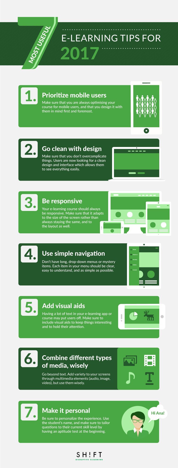
1) Prioritize mobile users
Make sure that you are always optimizing your course for mobile users, and that you design it with them in mind first and foremost. Mobile browsing is a big portion of the market, and if your course doesn’t work well on mobile, you will run into problems immediately. Users are less likely to choose you if they can’t learn on the go.
Read more: Start Thinking of Micro Learning Moments Now
2) Go clean with design
Make sure that you don’t overcomplicate things. Users are now looking for a clean design and interface which allows them to see everything easily. They don’t want loud patterns or busy menus. There’s no need to stick a photograph in the background and fade it out. A clear white screen with simple and clean buttons works best. Try out new designs in A/B testing, and you will see the difference.
Read more: 9-Point Checklist for the Perfect eLearning Course Design
3) Be responsive
Your e-learning course should always be responsive. Make sure that it adapts to the size of the screen rather than always staying the same, and to the layout as well. If a user turns their phone sideways, your course should move with them, rather than stay in the portrait layout. They should also be able to zoom in with a pinch. Without this, users may have difficulty using the course on the go or in a comfortable way.
Read more: Why Responsive eLearning is Essential to Meet Modern Learner Needs
4) Use simple navigation
Don’t have long, drop-down menus or mystery items. Each item in your menu should be clear, easy to understand, and as simple as possible. Cut down a number of steps needed for navigation. For example, let’s say that you offer a language learning course. Don’t have the user select their language every time they log in, but remember it. When they get there, offer the chance to continue where they left off or select a particular lesson. This cuts out two extra clicks for those who just want to carry on from last time and simplifies their user experience.
5) Add visual aids
Having a lot of text in your e-learning app or course may put users off. Make sure to include visual aids to keep things interesting and to hold their attention. This will be important for ensuring that they learn at best possible rate.
Read more: 10 Types of Visual Content to Improve Learner Engagement
6) Choose your multimedia, wisely
As well as using pictures to explain a concept, you can use them to teach, alongside other mediums. This way, you will appeal to different learning preferences, which is very important for the diverse students that you will take your course. Some learn better by writing notes, some by listening to a voice, some by watching a video, and some by doing an exercise.
However, be careful. More media and visual content doesn't mean learners will learn more, so don't go overboard with these.
7) Make it personal
Finally, be sure to personalize the experience. Use the student’s name, and make sure to tailor questions to their current skill level by having an aptitude test at the beginning. This will make them feel more like they are getting a personal service, which they will love.
Also read: Humanize Your eLearning Courses or Risk Losing Learners
Having a great e-learning course is not just about good lessons, but also good user experience. That generates good reviews, which leads to more students and referrals!
Cindy Parker is the professional writer and Content Specialist. She loves to write about small businesses, education, and languages. Currently, she works for Learn to trade - a currency trading education company based in Australia.
Ready to transform your corporate training?
See real results from companies that train with SHIFT — or talk to our team.