It’s part of your job as an eLearning course developer to polish up your material before you hit publish. A single error speaks volumes. It tells learners you’re in a hurry to even check the course or think you don’t care enough about details. Worse, it may substantially delay or prevent them from completing on time. Don’t let careless mistakes muck up your eLearning courses.
Here are 10 careless mistakes we've seen eLearning professionals make that have the potential to totally mess with the effectiveness of your courses:
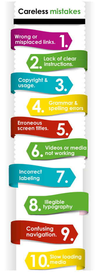
1) Wrong or misplaced links.
They may either be in the wrong place or nowhere to be found. Links are important extensions of your course content. They point to additional resources or further explain a subject. Double check them by clicking and verifying each link. Make them clear, specific, brief and accurately labeled.
2) Lack of clear instructions.
Vague instructions for quizzes, tests and games confuse learners. This is especially important in highly interactive tasks (think drag-and-drop games) and situations where they need to interact with content on-screen. Instead of completing activities to help students check their progress, unclear instructions can frustrate them and may even discourage them from continuing the course.
3) Copyright and usage.
The Internet is the best place to scour for educational images and other materials. But it isn’t a free-for-all place. When you use an image or data, make sure you’re not violating copyright laws. Check if it’s free for educational or commercial purposes. Google Search and other image sharing services such as Flickr usually makes it clear if the image is free to use. If you’re using Google, click on the Advanced Image Search and choose “free to share or use, even commercially” in the “usage rights” box. Flickr also has an Advanced Search feature that lets you filter images by usage rights.
This doesn’t just go for images. Some research companies may offer data and statistics for a fee. Avoid getting penalized by making sure that you’re legally allowed to use a material for your specific purpose.
4) Grammar and spelling errors.
eLearning course developers are expected to master grammar and spelling. This is the most evident way of showing learners that you’re dead serious about grammar and spelling. Remember, fluency in both spoken and written language is an essential skill for learners. What’s more, errors can hurt your credibility. You may lose learners as a result. Be sure to check your material for spelling and grammar mistakes.
5) Erroneous and unformatted screen titles.
Group screen titles when checking and editing them. You can easily do this by looking at the course menu, where all titles are listed. Are your titles logically organized? Are they written consistently or based on your style guide? Also, don’t forget to fix the format of your titles and subtitles. You can keep them in bold, italics or underlined formats.
6) Videos or media not working.
Many students rely on videos and interactive content. Why not? They’re much more efficient in packing a ton of content in as little as five minutes. The problem is, videos are prone to glitches. They play but are unable to sync accurately with the audio. Or they sometimes don’t play at all. Make sure your videos are working properly by reviewing your course just before opening it for students.
7) Incorrect labeling of graphics,charts, and diagrams.
These visual tools help simplify and organize content-heavy courses. Labeled incorrectly, they can misinform or confuse learners. Take a look at each name or number and edit them separately to make sure they are correct.
8) Illegible typography
This one might seem obvious, but it’s definitely not. Great typography is a huge part of a user-friendly experience; and if yours isn’t set correctly, you’re going to be losing learners' attention quickly.
9) Confusing navigation buttons.
Navigation is one of those things you must get right. Create a course that has a friendly direction, that includes the intuitive nagivation people look for, and that's immediately clear to the learner what to do next. Try to keep every button simple.
10) Slow loading media.
Nothing frustrates people more than waiting for an image of video to load more than five minutes. You definitely want to deliver the course's content to them as quickly as possible. So, start by getting to know your users, specially if they have slow connections or older hardware. Then, be sure to optimize all of your media so that it loads quickly.
Our tip: Set up a checklist and make sure each of the points are covered!
So next time you create an eLearning course, check it over for these errors. It should be error free. Here's a formula: polish and perfect it before hitting publish.
What are some other things that people do that kill eLearning courses? And how can they be avoided?