Many eLearning courses are still so full of features and elements that so many learners hate, we think it's time you take a peek at this list. This twelve elements will work as your guide for what not to do when designing your eLearning courses. So, ready it carefully and make sure you aren't adopting any of these bad practices.
People Hate it When Your eLearning Courses…
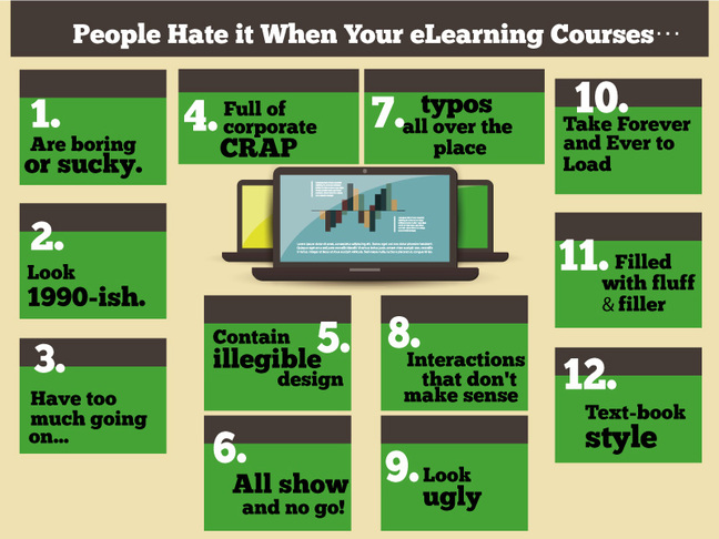
1) Are boring or sucky:
With so many interactive options available, why do eLearning course developers still deliver simple click-n-read courses, full of text and with old-fashioned style effects? That needs to change! There are no excuses fore creating boring and ugly content. Include some videos, animations, scenarios, simulations, etc. Use your creativity!
2) Looks 1999-ish:
Make sure your courses present the most updated version possible. If it looks like you haven’t updated it in many years, learners will loose credibility and think it's unprofessional. Review your material constantly to make sure your ideas, facts and concepts are up-to-date. It takes nothing to add and subtract a couple of links, images and stats from a course.
3) Have too much going on:
Some eLearning courses have screen that are so cluttered with content and graphics that learners don't know even where to look first. When there is so much to take in, learners feel so overwhelmed they end leaving the course or moving on to the next screen.
4) Full of corporate crap:
Incorporating industry jargon into your content definitely makes learners hate your eLearning course. You won't impress them with a lot of words they don't even understand. Instead, make simple word choices and learn how to adjust your language so what you say is accessible to everyone.
5) Contain illegible design:
If you’re spending a lot of time putting together an attractive visual design, first make sure your content is easy to read and consume. If it isn't read easily, no amount of visuals and media will grab your learner's attention.
6) Are all show and no go:
Content that simply is superficial and decorative doesn't work for eLearning. For a deeper and meaningful learning experience you need to make the learner think, reflect and then act. Instead of simply telling those raw facts on the screen, you should tell learners what you want them to do. Go beyond simple descriptions!
7) Have typos all over the place:
Typos and poor grammar are a clear sign of poor quality courses. In eLearning, you have to be focused on detail as much as anything. If you’re not paying attention to those small details then what kind of message does it give out to your learners?
8) Interactions that don't make sense:
Don't include interactions for interaction's sake, or ask learners to learn facts and concepts they will never really use at work. Just include interactivity when it actually helps, supports and guides the learning experience.
9) Look ugly:
If your courses look ugly, you're definitely starting with your left foot. First impressions matter and eye-pleasing content sells. Good screen design will help the students learn better while poor and ugly designs will make it difficult for them to learn better.
10) Take Forever and Ever to Load:
If you have images and videos on your courses, make sure they load quickly. People aren’t going to wait for ever to see them!
11) Filled with fluff and filler:
Are your eLearning courses painful to get through? Are they filled with non-relevant content that isn't direct and straightforward? Text is an essential element, but less words that get straight to the point will work better. Focus on what's important and leave out the "nice-to-have" information.
12) Text-book style:
The problem with treating eLearning courses like textbooks is that learners scan them rapidly, go through some screens they find interesting, and don't remember most of what they've just read. So, less text book style text, more engaging content!
What do you hate?
Take the time to audit your courses and make sure you’re not using outdated trends that are turning learners away.
Now it's your turn! Fill in the blank: I hate it when eLearning courses are _____________