As the cliche goes, beauty is in the eye of the beholder. People decide what is beautiful in accordance with their own likes and dislikes. However, studies on what we find aesthetically pleasing find that in truth, there is a serious science to making things beautiful.
We make split second decisions about the aesthetic nature of images, products and websites, often within milliseconds (studies of brain activity suggests that aesthetic impressions form within 300ms to 600ms ). These judgments, formed early and quickly, affect the way someone interacts with the product. In essence, we either trust something or not based on our first impressions.
In eLearning, the aesthetic quality of a course can improve the learning outcomes. Content matters as well, but the beauty of the course shouldn't be underestimated.
eLearning professionals who understand that they need to present content in aesthetically pleasing way, will be able to better share that content. So, increase the effectiveness of eLearning courses by applying three basic principles of aesthetic design.
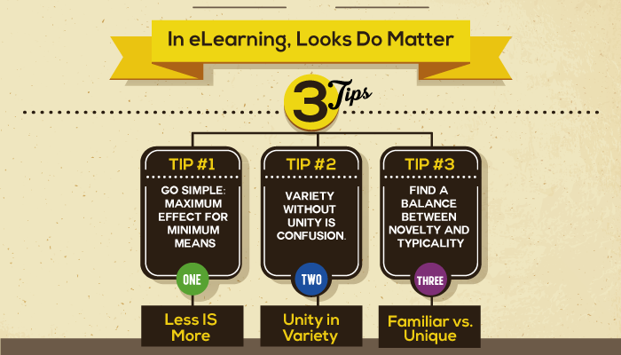
1) Less is More: Simplicity in Design
Or as Dr. Koichi Kawanain says: "Simplicity means the achievement of maximum effect with minimum means."
Think about a Zen garden. The idea behind these gardens is simplicity. A few well placed rocks, open spaces and raked gravel transforms into a thing of beauty and serenity.
Applying the principle of simplicity in eLearning means relaying information through the simplest means possible. Less information will always be preferred over more information. Too often, designers use every trick in their bag on every screen of a course as a way to engage the learner. However, when too much clutter vies for the learner's attention, the learner may not see the forest for the trees. They end up thinking the course isn't worth so much effort, and the content gets lost.
To achieve simplicity in eLearning course design, first identify the key concept a course screen needs to convey. Then, strip away extraneous elements that distract rather than enhance the concept, just like the Zen garden. Looks matter but, more importantly, simple ideas matter.
2) Use a Style Guide
Within chaos, humans look for order. If they can't find it, they move on. In design, this means having unity within variety so that learners can quickly and easily find patterns, make sense of information, and find connections between concepts.
This concept is easily achieved in eLearning design by creating a style guide. A style guide sets out a template for creating unity within variety by determining ahead of time elements such as:
- Font size and font choice for different elements such as page headers, article titles, body text, captions and other text options;
- Borders and placement for images;
- The look and placement of function buttons like save, back, or next;
- And other elements that occur on several pages.
By having a style guide in place before design begins, the course naturally finds order within the chaos and increases the effectiveness of the course.
3) Familiar vs. Unique
Studies that examine how and why people find something beautiful show an interesting contrast. People want diversity and novelty, but they also want familiarity. We look for the familiar because it's easier to process. We look for the unique as part of natural curiosity.
Designers have boiled this conflict down to the principle called MAYA or most advanced yet acceptable. Basically, what is the furthest you can stretch a familiar concept so that it becomes new, different and exciting while still retaining enough of the familiar so a learner doesn't get turned off?
Employ this concept in eLearning design by:
- Changing up scenarios or hypothetical situations that tweak the familiar;
- Using games to learn a new concept rather than text;
- Adding animation to explain a process instead of flow chart;
- Or adding different variables to a familiar scenario to reinforce a concept.
Aesthetically pleasing design is much more than making an eLearning course pretty. Taking time to employ these three aesthetic design principles could also make an eLearning course more effective, too.
Furthers Readings:
Design aesthetics: principles of pleasure in design
Visual Aesthetics in human-computer interaction and interaction design