
SHIFT's eLearning Blog

Our blog provides the best practices, tips, and inspiration for corporate training, instructional design, eLearning and mLearning.

To visit the Spanish blog, click here
    All Posts

    In eLearning, Looks Do Matter: 3 Ways to Create Aesthetically Pleasing Courses

    As the cliche goes, beauty is in the eye of the beholder. People decide what is beautiful in accordance with their own likes and dislikes. However, studies on what we find aesthetically pleasing find that in truth, there is a serious science to making things beautiful. 

    We make split second decisions about the aesthetic nature of images, products and websites, often within milliseconds (studies of brain activity suggests that aesthetic impressions form within 300ms to 600ms ). These judgments, formed early and quickly, affect the way someone interacts with the product. In essence, we either trust something or not based on our first impressions. 

    In eLearning, the aesthetic quality of a course can improve the learning outcomes. Content matters as well, but the beauty of the course shouldn't be underestimated.

    eLearning professionals who understand that they need to present content in aesthetically pleasing way, will be able to better share that content. So, increase the effectiveness of eLearning courses by applying three basic principles of aesthetic design.

    BEAUTIFUL

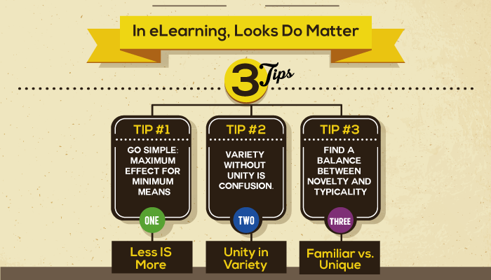
    1) Less is More: Simplicity in Design

    Or as Dr. Koichi Kawanain says: "Simplicity means the achievement of maximum effect with minimum means."

    Think about a Zen garden. The idea behind these gardens is simplicity. A few well placed rocks, open spaces and raked gravel transforms into a thing of beauty and serenity. 

    Applying the principle of simplicity in eLearning means relaying information through the simplest means possible. Less information will always be preferred over more information. Too often, designers use every trick in their bag on every screen of a course as a way to engage the learner. However, when too much clutter vies for the learner's attention, the learner may not see the forest for the trees. They end up thinking the course isn't worth so much effort, and the content gets lost. 

    To achieve simplicity in eLearning course design, first identify the key concept a course screen needs to convey. Then, strip away extraneous elements that distract rather than enhance the concept, just like the Zen garden. Looks matter but, more importantly, simple ideas matter. 

    2) Use a Style Guide

    Within chaos, humans look for order. If they can't find it, they move on. In design, this means having unity within variety so that learners can quickly and easily find patterns, make sense of information, and find connections between concepts. 

    This concept is easily achieved in eLearning design by creating a style guide. A style guide sets out a template for creating unity within variety by determining ahead of time elements such as:

    • Font size and font choice for different elements such as page headers, article titles, body text, captions and other text options;
    • Borders and placement for images;
    • The look and placement of function buttons like save, back, or next;
    • And other elements that occur on several pages.

    By having a style guide in place before design begins, the course naturally finds order within the chaos and increases the effectiveness of the course. 

    3) Familiar vs. Unique

    Studies that examine how and why people find something beautiful show an interesting contrast. People want diversity and novelty, but they also want familiarity. We look for the familiar because it's easier to process. We look for the unique as part of natural curiosity. 

    Designers have boiled this conflict down to the principle called MAYA or most advanced yet acceptable. Basically, what is the furthest you can stretch a familiar concept so that it becomes new, different and exciting while still retaining enough of the familiar so a learner doesn't get turned off?

    Employ this concept in eLearning design by:

    • Changing up scenarios or hypothetical situations that tweak the familiar;
    • Using games to learn a new concept rather than text;
    • Adding animation to explain a process instead of flow chart;
    • Or adding different variables to a familiar scenario to reinforce a concept.

    Aesthetically pleasing design is much more than making an eLearning course pretty. Taking time to employ these three aesthetic design principles could also make an eLearning course more effective, too.

    Furthers Readings:

    Design aesthetics: principles of pleasure in design

    Designing beauty

    Visual Aesthetics in human-computer interaction and interaction design

     

    eLearning free ebook


    Click me
    Karla Gutierrez
    Karla Gutierrez
    Karla is an Inbound Marketer @Aura Interactiva, the developers of SHIFT. ES:Karla is an Inbound Marketer @Aura Interactiva, the developers of SHIFT.

    Related Posts

    The Forgetting Curve: Why Your Training Is Erased Within a Week — and How to Stop It

    Learning Science & Retention Your people don't have a motivation problem. They have a memory problem — and a 140-year-old experiment maps it precisely. Here's what the science says, and what to do about it on Monday morning. Picture the last mandatory training your organization ran. The completion dashboard glowed green. People passed the quiz. Leadership checked the box. Now ask an uncomfortable question: how much of it could those same employees actually use two weeks later? If the honest answer is “not much,” you're not looking at a failure of effort or attention. You're looking at a fundamental property of the human brain — one that was measured, plotted, and published before the light bulb was in common use. It's called the forgetting curve, and until your learning strategy accounts for it, you are quietly paying to fill a bucket that has a hole in the bottom. A 19th-Century Experiment That Still Governs Your Training Budget In the 1880s, a German psychologist named Hermann Ebbinghaus decided to do something no one had tried: measure memory itself. He created hundreds of meaningless three-letter syllables, memorized them, and then tested how much he could recall after 20 minutes, an hour, a day, and beyond. He plotted the results. What he found has a shape every executive would recognize as a problem: memory doesn't fade gently and evenly. It collapses fast at first — the steepest loss happens within hours of learning — and then the decline slows as whatever survives settles in. Draw it on a graph and you get a cliff, not a gentle slope. Here is the version that matters to anyone responsible for a workforce: 100% 75% 50% 25% 0% Knowledge retained Day 0 Day 1 Day 3 Day 7 Day 30 Time after training review review review One-and-done training Training + spaced reinforcement The red line is what most corporate training buys: a steep drop-off in the days after the session. The green line shows the same content reinforced at spaced intervals. Each review lifts retention back up — and each time, the memory decays more slowly than before. The curve gets flatter with every touch. The important detail isn't the exact numbers on the axis — those vary by person, by material, and by how meaningful the content is. The important detail is the shape. Learning delivered once, then never revisited, follows the red line down. And no amount of polish on the original session changes that trajectory. A beautifully produced course that is never reinforced forgets just as fast as a boring one. This Isn't a Theory. It Has Been Replicated for 140 Years. It would be fair to be skeptical of a result from the 1880s built on one person memorizing nonsense syllables. So it's worth knowing that Ebbinghaus's curve is one of the most durable findings in all of psychology. A rigorous 2015 replication reproduced his forgetting curve closely, confirming that the basic shape holds up under modern methods. More importantly for organizations, the solution the curve implies has been tested far more broadly than the curve itself. A landmark scientific review synthesized 317 experiments on how the timing of practice affects memory. The conclusion is one of the most consistent in learning science: spreading learning out over time produces dramatically better long-term retention than cramming it into a single session. Same content, same total time — different result, purely because of when it was delivered. 317 separate experiments, synthesized in one landmark review, point to the same conclusion: spaced learning beats massed learning for durable retention. This is not a trend or a vendor claim — it is settled science. “The single most under-used lever in corporate learning isn't better content or bigger budgets. It's timing. When you deliver training is as decisive as what you deliver.” Why the Standard Corporate Training Model Fights the Brain Most organizational learning is designed almost perfectly to sit on the wrong line of that graph. Consider how a typical program works: 1 It's an event, not a process A half-day workshop, an annual compliance module, a one-time onboarding marathon. The brain treats a single exposure as low-priority information and prunes it — exactly as the curve predicts. 2 It front-loads everything Cramming a year's worth of policy into one sitting feels efficient and is the opposite. Massed delivery is the single fastest way to guarantee the steep red curve. 3 It measures completion, not retention A 95% completion rate tells you people sat through the content. It says nothing about whether they'll remember it when the moment to apply it arrives — which is the only thing that affects performance. 4 It never comes back Without a deliberate second, third, and fourth touch, there is no mechanism to interrupt forgetting. The reinforcement that flattens the curve simply never happens. The result is an expensive illusion of learning. The activity is real. The lasting capability is not. And because the forgetting happens quietly, weeks after the training when no one is looking, the loss rarely shows up on any report. What Working With the Curve Looks Like Instead The good news hidden in the forgetting curve is that it also hands you the fix. Every time a memory is retrieved and reinforced, it decays more slowly afterward. So the entire game becomes: interrupt the drop-off, at the right moments, with the least possible friction. Here is how that translates into practice. The event model (fights the curve) The reinforcement model (works with it) One long session, then silence A short initial session, then spaced follow-ups over days and weeks Passive re-reading of slides Active recall — a quick question that forces the brain to retrieve the answer Everyone reviews everything People revisit what they got wrong, not what they already know Training lives in a separate portal Reinforcement arrives in the flow of work, in two-minute doses Success = course completed Success = knowledge still there weeks later, and visible in behavior 1. Turn the event into a sequence The most powerful change costs almost nothing: stop thinking of training as a day and start thinking of it as a campaign. A 40-minute course followed by three short reinforcement touches over the next month will outperform a two-hour course followed by nothing — with less total seat time. 2. Make people retrieve, not re-read Reinforcement works because the brain has to pull the answer out, not because it sees the content again. A single well-placed question — “What's the first step if you spot this?” — does more for retention than re-watching the whole module. Build retrieval into every touch. 3. Space the touches, then widen the gaps Revisit new material soon after the first exposure, then let the intervals grow — a day, then several days, then a couple of weeks. As the memory strengthens, it needs reinforcing less often. Each cycle buys a flatter curve and a longer runway. 4. Personalize what gets reviewed Forcing a top performer to review what they already know wastes their time and erodes goodwill. Reinforcement should concentrate on each person's weak spots. This is where the reinforcement model stops being a scheduling exercise and starts requiring a system that can adapt to the individual. Key Takeaway The forgetting curve is not a reason to spend more on training. It's a reason to spend differently. The organizations that win aren't the ones with the biggest course libraries — they're the ones that reinforce a smaller amount of content at the right moments, so it actually survives. The Business Case Is Simpler Than It Looks Strip away the neuroscience and the argument for organizations is blunt. If most of what you teach is gone within a week, then the true cost of one-and-done training isn't the price of the course. It's the price of the course plus everything that goes wrong because the knowledge wasn't there when it counted — the compliance miss, the safety lapse, the sales conversation that fell flat, the new hire who takes twice as long to become productive. Reinforcement doesn't just improve a training metric. It's the difference between learning that changes what people do and learning that briefly changes what they can recite. For any leader who has ever wondered why a well-run training program didn't move performance, the forgetting curve is usually the answer — and the reinforcement model is usually the remedy. How SHIFT Helps You Beat the Curve This is precisely the problem SHIFT was built to solve. For nearly three decades, we've helped global organizations move learning off the steep red line and onto the flatter green one — not with more content, but with smarter delivery. Our AI-powered ecosystem is designed around how memory actually works: create engaging learning fast, then reinforce it with spaced, retrieval-based touches that adapt to each learner and reach them in the flow of work. Instead of a single event that fades by Friday, you get a sequence engineered to make knowledge stick — and the measurement to prove it did. 1 Built for reinforcement, not just delivery Learning is designed as a sequence of well-timed touches, so retention is engineered in from the start rather than hoped for after the fact. 2 Adaptive by design Each learner spends their time on what they haven't yet mastered — the personalization that makes reinforcement efficient instead of tedious. 3 Proven at global scale Six million people trained across more than 43 countries, backed by nearly 30 years of eLearning expertise and roughly 20 industry awards. This is battle-tested, not experimental. Stop paying to be forgotten. See how SHIFT turns one-and-done training into learning that survives the forgetting curve — and shows up in performance. Request a Demo The Bottom Line Ebbinghaus proved something in the 1880s that most organizations still ignore in the 2020s: without reinforcement, learning evaporates, fast. The forgetting curve isn't a footnote in a psychology textbook. It's a line item in your budget — the invisible cost of every program that ends the moment the session does. You can't switch off forgetting. But you can decide which curve your people ride. The question isn't whether your training is being forgotten. It's whether you're going to do anything about it. Sources: Ebbinghaus, H., Über das Gedächtnis (1885) • Murre, J.M.J. & Dros, J., “Replication and Analysis of Ebbinghaus' Forgetting Curve,” PLOS ONE (2015) • Cepeda, N.J., Pashler, H., Vul, E., Wixted, J.T. & Rohrer, D., “Distributed Practice in Verbal Recall Tasks,” Psychological Bulletin (2006)

    Every Employee Now Has a Tutor That Never Sleeps. The Question Is Who Controls It.

    The most important shift artificial intelligence brings to corporate learning is not that it can generate a course in minutes. It is that, for the first time, every employee in your organization can have something that used to be reserved for executives and elite athletes: a patient, always-available coach that answers the exact question they have, at the exact moment they have it.

    Your Best Knowledge Shouldn't Train Someone Else's Model

    Every organization is quietly sitting on a body of knowledge it spent years and serious money to build: the way it onboards people, the methods that make its training work, the hard-won answers to questions customers actually ask, the playbooks that separate it from competitors. For most companies, that knowledge lives scattered across documents, courses, recorded sessions, and the heads of a few experienced people.

    {{ footer_js() }} {{ js_integration_body_end() }}
