Despite the utility of multimedia in eLearning, images and even videos can only go so far: the core source of information remains text. Accordingly, a basic knowledge of typography is a must for any eLearning designer. Good typography enhances readability, encourages information processing, creates a visual hierarchy, and even engages readers' emotions. Here is a 7-step guide to making your course more effective—with typography in mind.

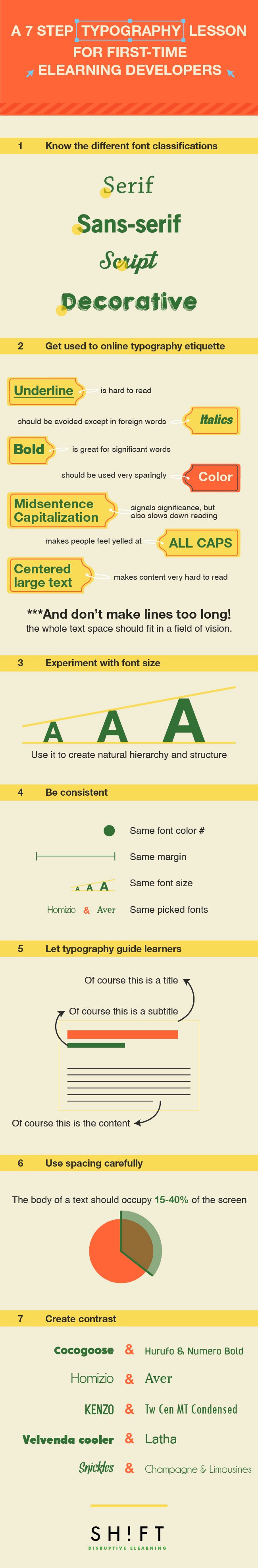
1. Know the different font classifications.
Fonts come in four main categories:
- Serif: letters with short lines coming off the edges. The impression is formal and traditional. Serif fonts are best suited for print.
- Sans-serif: letters without the above short lines. The impression is informal and playful. Despite the reputation, these letters are excellent for digital media.
- Script: fonts resembling handwriting. Definitely a poor choice for large blocks of text.
- Decorative: informal, idiosyncratic fonts. They work well as headlines, but not in body copy.
For eLearning screens, sans-serif fonts are almost always the best bet, as they are the most easily legible. Verdana is a traditional choice, as it was designed specifically to display well on computers.
Recommended resources:
- Infographic: Serif vs. Sans: the final battle
- Best Practices of Combining Typefaces
- What font should I use?
2. Get used to online typography etiquette.
- Underlining makes words "busy" and hard to read. Besides, they may signify hyperlinks.
- Italics are also harder to read, and should be avoided except in foreign words and phrases such as in situ. The key relies on not using italics for more than a word or two.
- Bold increases text visibility; use it for headings and words of significance. But don't overdo it!
- Midsentence Capitalization signals significance, but also slows down reading.
- ALL CAPS makes people feel yelled at; avoid at all costs.
- Color should be used very sparingly. Black text on white is always your best bet.
- Centered text makes content very hard to read.
- Don't make lines too long: the whole text space should fit in a field of vision.
- For the headings, always use larger than your body text.
3. Experiment with font size.
The standard size for e-text reading is 12-pt font; certainly, for eLearning never go below 10. However, on tablets and phones 14- and even 16-pt font has become a popular default. Think about your target audience, what devices they use and how acute their vision is.
Whichever base size you choose, relative font size can be used to create natural hierarchy and structure. Larger words are often used for headings, titles, or terms of importance, as they draw the eye.
Note: Dominant headlines, especially when placed in the upper left corner, typically draw the eyes first.
4. Be consistent.
Overall continuity in design helps learners know what to expect and how to find information easily throughout the course, as they only have to get used to one structure and can then focus on the content. Keep text location consistent from screen to screen, above all, and use similar formatting. If you use bullets, use them the same every time. Always place headings and subheadings in the same place. This will allow for maximum readability, as inconsistency can confuse learners.
The number of fonts you use is an important consideration too. While it’s okay to work with just one font, it can make the course stale. Use no more than one or two fonts, three at most. They create hierarchy and interest but can easily be overdone.
For example, choose a combination of fonts that complement each other: Helvetica Neue and Garamond (Here are other 20 perfect font pairings). This will enable you to have some variety and visual contrast without becoming too much.
5. Let typography guide learners.
As an eLearning designer, the important thing is to create an obvious hierarchy, and typography is an effective tool to use in visual hierarchy.
To help readers focus, keep your information sorted according to natural reading patterns. Learners usually enter through a visual element, such as a heading or use of color. From there, the most important information should be at the top left, with other critical content also near the top. With the right font, font size, spacing and color, you create a visual hierarchy that assists the visual walk-through.
6. Use spacing carefully.
The body of a text should occupy 25-40% of the screen, with line spacing in proportion to the text size. The key thing to avoid is a dense "brick" of text, which loses the eye quickly. Resist the urge to adjust margins to fit in more text; if you can't make it more concise, pick a more condensed typeface or go down a font size. A small font is easier to read than a cramped one.
White space is key in organizing your screen and maintaining flow. Without it, content takes longer to read and is more frustrating, as readers must first analyze the page visually to distinguish one element from the next. Keep a solid space barrier around your words to prevent the eye from wandering in the wrong direction.
Studies, in fact found a 20% increase in comprehension due to effective use of whitespace. So make sure an ample amount of space surrounds the text.
7. Create contrast.
Don't let your screen look scattered or overwhelming! Set up contrasts to manage learners' focus, between different fonts or between text and empty space.
Learners naturally scan from point to point rather than reading line by line. In order to make this work for you, use typographic contrast to create emphasis on certain text. Not only does this enhance the visual appearance, but it also directs the learner's attention to the important content. Whether using size, color, spacing, or shape, remember that one appearance should be used for "ordinary" content, and one for critical elements. Use the second one sparingly, lest it lost impact.
Don't be afraid to experiment, but at the same time, never sacrifice legibility to aesthetic appeal. Get the balance right, and your screen will be clear and appealing, neither boring nor illegible.
Recommended Resources:
- Use Typtester to compare screen types
- 10 Commandments of Typography
- Video: The Seven Deadly Sins of Typography
- Best tutorials to learn typography
- Fonts in Us: A really great resource for finding font inspiration
- Pinterest Board: Typography Essentials
- What is Typography