 Color Psychology: Use Warm Hues to Energize Your eLearning">
You might have often noticed how a pop of color can instantly uplift your mood. But have you ever spared a thought about how it can change the course that you are currently designing? If you are not aware yet, the color that you use in your courses can have a tremendous impact on the mood of the learner and how they ultimately absorb the information.
Now you may ask how colors can impact an eLearning course. Well, 70 percent of the information that people capture in their minds is through visual clues. And this is primarily the reason why colors can have a deep impact on your learners.
There are several ways in which colors can change the entire outcome of your course. Certain colors reduce the stress level while others challenge your grey cells through visual stimulation or pattern seeking. Visual stimulation encourages visual thinking and reduces impassiveness.
Give a thoughtful consideration before choosing a color palette for your course. When colors are chosen correctly, you can influence how learners decipher what they see.

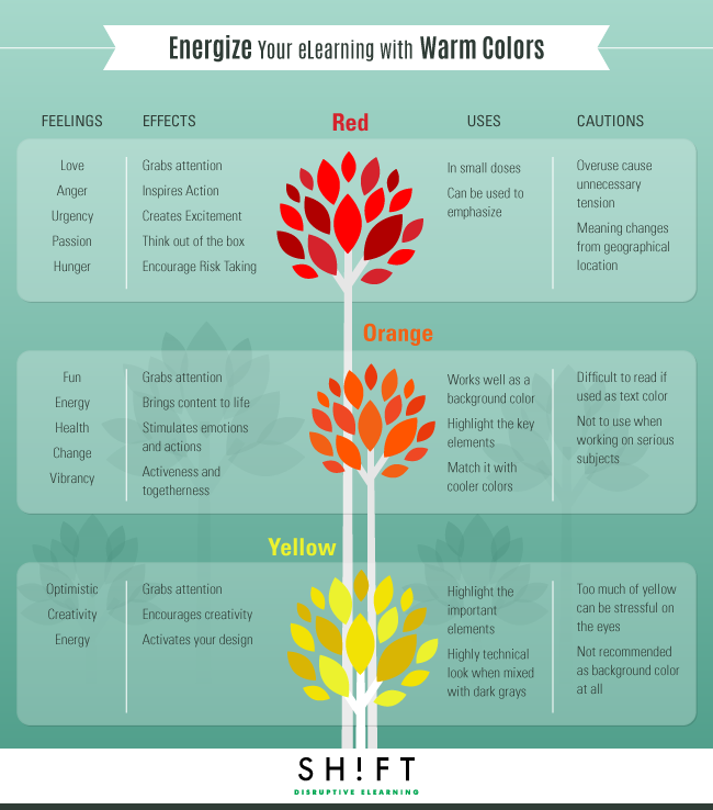
Warm Colors
Warm colors are the most exciting on the color wheel. They are your oranges, reds and yellows. They mostly remind us of the fire and the sun. They bring about vivaciousness and energy into your courses. These are the best colors to use in your courses when your goals are to draw attention, promote focus and drive energy, enthusiasm and motivation.
When you use warm colors in your design, it instantly creates hyper vibes within your learner. Note that the use of warm colors should be done in a way that it does not create hyper energy and distracts the learners by causing psychological headaches. A way to achieve this is to use it in contrast with their cooler counterparts to strike the perfect balance (we'll be covering this on the next blog post).
But how to use warm colors in your eLearning courses?
That’s an interesting situation as each of the warm colors when used in the course singly or in combination with its counterparts bring about an engaging association with the learners.
Read: Use Cool Colors to Set Just the Right Mood for Learning
1. Red
This is the most intense of all the warm colors in the color wheel. Red is a color that our bodies respond to physically (it increases heart beat and creates a state of arousal). You can use it in eLearning to encourage learners to take action, to generate and attract attention and to create interest. It can also be used to encourage learners to think out of the box and prepare them to take risks.
Red is more suited as an accent color and not a principal color for your entire course. You should use it very carefully; else it can bring an overwhelming effect and cause unnecessary tension within your learners.
Again the interpretation of this color is varied in different parts of the world. In France, it denotes masculinity whereas in Africa, it is a color of mourning. In the Asian continent, it symbolizes happiness, union, prosperity, etc. Hence when using this color, make sure you keep the geographical location of the learners in your mind. If the course is targeted towards a global audience, it is better to avoid this color.
The most interesting way to use this color is to mix it with a dash of grey, silver, or white. You can also use it to emphasize navigation menus and certain parts of the text, but again the learner geography and culture should be considered.
Takeaways:
- Use red to draw attention to relevant and important concepts.
- Red can be used to emphasize text and navigation menus.
- Small doses of red can often be more effective than large amounts of this color.
- Recommended uses: Healthcare, fashion, entertainment and food.
2. Orange
Orange hues reflect vibrancy, adventure, competition and change. Orange is both thought provoking and mentally stimulating, so it gets people thinking and interacting. At times, it works better than red in capturing the strength and confidence of the learner. If you notice this is one color, which is profusely used by sport teams across the globe and also in many products that are targeted towards kids and teens. The reason is that the orange color means activeness, fun, togetherness, etc.
Again, too much of this color can have an adverse effect. It mostly works well as a background color and not as text color since it is too light and is difficult to read even when paired against its warmer counterparts. In courses that promote human emotions and actions, orange is a great color to work with.
Takeaways:
- Be careful when using orange for text; because it’s a lighter color, it’s always going to be more difficult to read.
- Use orange to make content seem more exciting and less boring. It will help you give a friendly and inviting feeling.
- Use orange to stimulate focus and concentration in highly technical topics. (Studies reveal is the best color for productivity and concentration).
- Use orange subtlety. For example, use photos that have a lot of orange.
- Recommended uses: technology, entertainment, food, and childcare topics.
3. Yellow
This is a color, which helps to create a very optimistic feeling. You can use yellow hues when you need to simulate the brain and the working memory, encourage creativity and create a sense of happiness and freshness in your design.
Again, at the same time too much or too less of anything is bad. Similarly too much of yellow can be stressful on the eyes. Using yellow as a background color is not at all recommended as it is a fast-moving color and can have a blinding effect. It is always suggested to use a soothing color as the background or primary color and use yellow to highlight the important elements in a design.
Using yellow with other colors is a way to strike the right balance too.Try to pair yellow with contrasting colors to make sure the message is conveyed clearly. For instance:
- Yellow when used with blue can make for an eye-catching combination.
- For a highly technical look, yellow when mixed with neutral shades or black can give the desired feel.
- Extremely pale shades of yellow goes well as neutrals with richer and bold shades of red and orange.
Finally, get inspired!
- Here are five warm color palettes to get you started.
- Here is a pinterest board full of warm color palettes.
- Check out these 20 Wonderfully Warm Designs

Ready to transform your corporate training?
See real results from companies that train with SHIFT — or talk to our team.