 6 Essential Graphic Design Principles to Guide Your eLearning Course Design">
While a great eLearning design can act as a tonic and engage the learner at an optimum level, a bad eLearning design can lull the learners to sleep.
That's right, how your learners perceive the instructional content is more often than not dependent on the design element. Learners ignore cluttered and boring design. They gravitate, instead, to one that’s aesthetically pleasing.
If you are new to design, or looking to brush up on eLearning design best-practices, this post is for you!
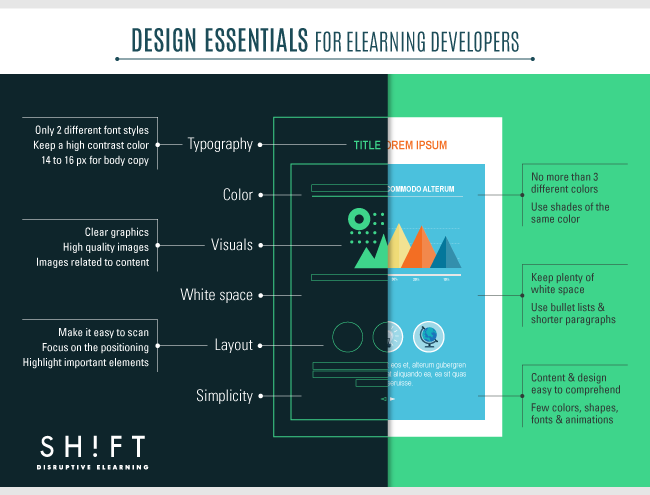
1) Typography
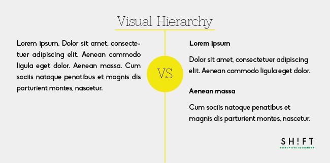
As we've mentioned in previous posts, good typography enhances readability, encourages information processing, creates a visual hierarchy, and even engages readers' emotions. Yes, you may not realize this often but the font style, color, size and the spacing makes a lot of difference in your design.
While choosing fonts, you should focus on:
- Setting a limited font palette that is clean and fuss-free. A combination of two font styles will have a great impact on the design.
- The font size should be easily legible for your learners. Usually, it is 14 to 16 pixels for the body copy in a typical font setting.
- Even if you are working on something out-of-the-box, don’t experiment too much with the fun quotient of your font. Keep it simple. Sans-serif typefaces like Verdana and Arial never fail.
Know the style of the main typefaces:

2) Color
The color palette that you choose can be a really tiresome task but at the end of it, you should ensure that the chosen color enhances and clarifies the entire look and feel. Some points on how you can choose the colors for your eLearning course:
- Try and include no more than three colors in your design. It serves as a good starting point and is enough to create a variation in the entire look.
- Stick to the 60-30-10 rule— rather than using an equal amount of each color, divide color use into 60 percent, 30 percent, and 10 percent.
- Be consistent with the font. You can use different shades of the same color to build on the consistency without marring the effect.
- Never use any background color that makes it difficult to read the font.
- Smart color combinations is the buzzword. Choosing fonts with a high level of contrast will always work on your favor.
Take a look at this guide to bring together the correct hues and apply them bringing harmony to your eLearning designs:
3) Whitespace
There should be plenty of white space in your eLearning screens. Using unnecessary graphics or irrelevant text to fill up the white space is not a good idea at all. Your visual message becomes potent only when your screen is less cluttered.
Some points on how you can make the white space work in your favor:
- Use more bullet lists and shorter paragraphs to increase the white space.
- Allow for ample white space between paragraphs and graphics to enhance attention.
- Emphasize the important elements on the screen by surrounding it with white space. This will ensure that the most important element is highlighted.
- The body of a text should occupy 25-40% of the screen.
4) Layout
Layout forms the base against which we visually convey the content or information we want to share with our learners.
Here are some pointers on how you can structure your layout and organize your content
- Make the screens and layout easy to scan in order to retain the learners.
- Attempt to highlight the important elements on the screen to ensure learners know where to focus after just a glance. You can achieve this by using tools such as size, color, alignment, contrast, just to name a few.
- Focus on the positioning techniques like proximity and grouping.
- Place significant information in the beginning or in the end. Never place important information within click-to-reveal icons.
- Create a strong focal point, which is the most important visual element in your design. This can get learners pay attention to the most important message.
5) Visuals
Any design screen is not complete without graphical elements. Even while going through the dullest content or course, some eye-catching graphics can change the mood of the learners and provide them with a different perspective altogether.
When it comes to visuals:
- The graphics should be clear and prominent.
- The images should relate to the content.
- The images should be of very high quality.
- Every image should have a purpose. Before you add it, ask yourself if it adds anything to the content. If it doesn’t, leave it out.
- Steer clear of stock photo clichés.
- When possible, use close-up shots of people in your course to help your learner identify with the message you have for them.
- The Rule of Thirds will help you place images on the screen, so they grab learner attention readily. Divide the screen into a 3x3 grid.
6) Simplicity
Simplicity is of utmost importance when you are designing an eLearning course. Here're some key guidelines that will help you master the art of simplification:
- Do not force unnecessary elements into your design. Every element counts in the design and make sure it is relevant to the theme and design.
- Try to use as few colors, shapes, and fonts as possible.
- Animations are good, but you should limit them to certain slides. Having one interactivity on each slide can make them lose their purpose and importance.
- Each paragraph should consist of no more than 3-4 sentences within 2-3 lines. This will avoid having too many ideas in a short space.
Keep these graphic design essentials in mind when crafting your eLearning courses, with enough practice, you'll develop outstanding results!
Ready to transform your corporate training?
See real results from companies that train with SHIFT — or talk to our team.