 A Place for Everything: Powerful Psychological Strategies for Use in Graphic Design">
Looking at websites of some of the biggest companies in the world (think Apple and Google), you’ll see they’ve come a long way regarding web and graphic design. From the days of cramming in as much content as possible, we’ve entered an era where every line, image, color, and call-to-action is well researched and tested to grab your attention, keep you engaged and make you take action.
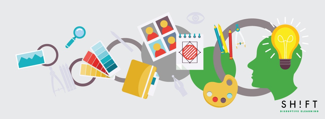
Graphic design has come a long way, within a couple of decades, and has gone beyond simple look and feel, to encompass a range of aspects related to people’s experiences. And, creativity alone won’t cut it. Graphic design has much to do with understanding user psychology as it does creativity. Create great eLearning experiences by applying these powerful psychological strategies:
1) Leverage mental models
Mental models are a person’s thought process for how something works. Remember the first day you took an iPad to your hand? You may have had a preconceived notion of how to switch it on and how various things work (e.g., reading a book, browsing social media, etc.). Apple is a master at encompassing intuitiveness into their design. In short, users, upon taking the device to their hand are instinctively able to figure their way around. The same goes for graphic design.
Start by mapping out how you want your users to respond to your eLearning design. Every aspect of your design process needs to be centered on the user’s experience. Your intuitive check would involve asking questions like
- How are the images placed (or are they moving left to right)?
- Is the messaging simple and easy to understand?
- Will the user, at a glance, know what to do next?
2) Colors and feelings
A lot of research has been conducted on how colors affect our moods. Next time you see an awesome website, remember that the colors they have used are not based on the designer’s preferences. Chances are, a lot of research had gone into what color would best match their users’ moods when going through the company’s content.
Here’s a quick rundown to help you get started:
- Red - Bold, passion, love, exciting, action (e.g., Coca-Cola)
- Blue - caring, trustworthy, calm, secure (e.g., Facebook)
- Yellow - Logical, forward-thinking, confidence (e.g., Commonwealth Bank)
- Green - Organic, growth, fresh, earth (e.g. Evernote)
- Orange - Happy, sociable, friendly (e.g., Hubspot)
- Black - Seductive, sophisticated, professional, elegant (e.g., Vertu)
- Multi-colour - playful, bold (e.g., Google)
Read more:
6 Ways Color Psychology Can Be Used to Design Effective eLearning
3) The odd man out aka. Von Restorff Effect
This principle suggests that of any visual element, it is the odd one that people tend to remember.
On an eLearning design project, although you may have many elements that help you tell your message, you would often want one specific element to stand out and be remembered. You can achieve this goal using a different color, font, shape or size. The benefits of following the Von Restorff Effect is evident on how successful websites make their CTA button or copy stand out for the rest.
4) Obey Hick’s Law
Hick’s Law states that the more options a person is presented with, the more energy it takes to make a decision. When a user is presented with plenty of options (i.e., navigation, buttons, products, etc.) the chances of them taking the next logical step (i.e., conversion) gets postponed or even lost. As a result, keep your graphic elements to a minimum. Ensure everything you put on the page contributes to one overarching goal. A good benchmark for this principle is Apple.
Read more: Add a Dose of Psychology to Create Great eLearning Courses
5) Pay attention to how users scan web pages and other material
People tend to scan online material as opposed to reading every word. When reading websites, they tend to follow an “F” shape - the headline, the first line of the leading paragraph and so on. If the content catches their attention, they may pause, and read carefully. As a rule of thumb, you have about 7 seconds to grab their attention. When placing various elements on your web page or marketing material, follow these rules:
- Important content ought to be placed “above the fold” (above the first scroll)
- Clear headline
- Don’t put in long harangues of content - easy, bite-sized chunks, please
- Use bullet points to improve scannability
Also read: How We Read Online— A Guide for eLearning Professionals
We all respond to different colors, fonts and shapes in different ways, in line with personal attributes. As discussed above, drawing from the principles of psychology you can customize your eLearning design projects to cater to your target audience’s characteristics.
Remember, great design is not just about how it looks, but also how it will function. What psychological strategies have you utilized in your own graphic design work?

Todd is the Director and Principal Psychologist at TG Psychology, in Penrith, NSW. He has over 14 years of experience working with adults and young people in both public health and private practice settings.
Ready to transform your corporate training?
See real results from companies that train with SHIFT — or talk to our team.