How do you liven up a dull room? You hang a painting or go in for a fresh paint job.
How do you wear a staid-looking dress and not look like a plain Jane? You accessorize it with a colorful scarf, a designer clutch, or a pair of killer heels.
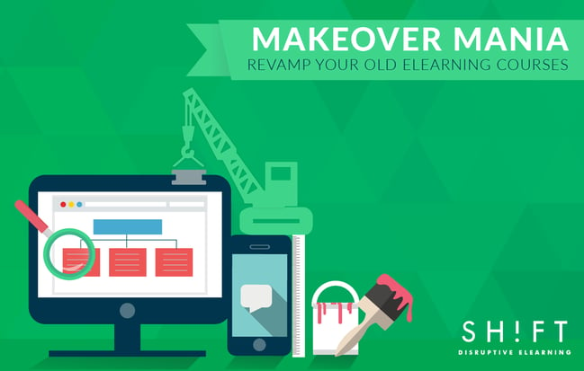
How do you revamp your old eLearning courses so that your learners are not bored to death? You can follow the tips below.
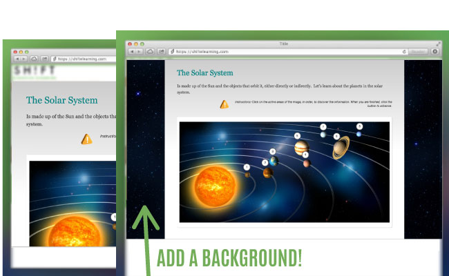
1. Add a background.
It is a wonder how an old and drab screen pops out when you just change the background. Just add a splash of color in the background to make the elements stand out. A large and high-resolution photograph can also do the trick. Or you can use textures and patterns to add a point of visual interest to your screens.
Find inspiration on how to use textures effectively here or see how other designers are using patterns in their creations here.
However, keep the following in mind before you add a background in your eLearning course:
- Ensure that it is not overwhelming and distracts from the instructional content on the screen.
- Make sure it aligns with the mood and theme of the course.
- Ensure that it maps to the client’s brand image.
- Keep in mind cultural sensitivity issues if you use photographs.
- Keep file size in mind too.
Here's an example of a well chosen background:
2. Cry out loud. Use large, rich typography for headings.
Who says text has to be boring. Play around and have fun with typography. Use large, rich, and eye-catching fonts to make headings, sub-headings, and critical pieces of information stand out. But beware of the following common pitfalls:
- Teeny-Weeny Fonts: Pay heed to the font size. Don’t make your learners squint and peer into the screen just to make out what is written on it.
- Illegible Fonts: Cursive fonts look attractive, but too many curls and twirls make text illegible.
- Glaringly Bright Colors: Colored texts or adding a band of color behind a chunk of text makes the content stand out. But do not create a riot of colors that distracts more than it emphasizes content. Also do not use colors so bright that they create a glare.
- Clutter on the Screen: Experimenting with typography and colors is fun. But do not go OTT and create clutter with too many fonts and too many different styles. Here’s how you can achieve more with less: Break up text and organize under headers or as bullet or numbered lists. Use variations of the same font. Even a simple ploy like using a bold font can make text stand out.
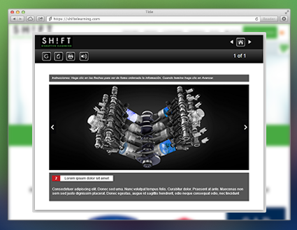
3. Big grabs eyeballs. Use large images.
Images grab eyeballs more readily than the fanciest of fonts. Big and high-resolution images are more attractive. What is more, they are not only compelling and hook learners but are also effective instructional tools. For instance, if your course aims to teach learners about the parts of a machine or some mechanical process, large and detailed photographs that magnify specific parts of the machine or show processes up close will help make content more memorable.
See this example:
4. Bright is right. Use bright colors.
There is nothing like a pop of bright color to give life to even the most listless screen. What is more, you don’t even need to switch to a different color palette to get the desired effect. Just brightening up the existing colors on the screen will do wonders. However, there are some color combinations that are more attractive than others.
Use these online tools to find inspiration for a color scheme that will compel learners to pay attention.
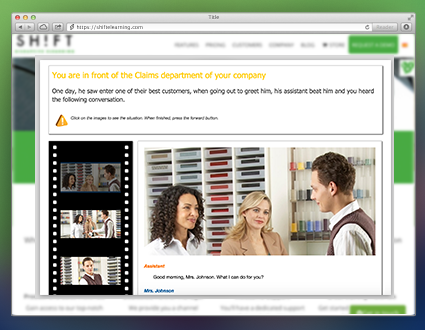
5. Get rid of large chunks of text.
Large chunks of text are boring. Some learners may even feel intimidated when they see a screen teeming with text. So liven up your old eLearning screens by representing text visually.
Use infographics, icons, timelines, or mind maps to present data that you would have otherwise written out. Besides, visuals also make for easy memorizing and are ideal for your corporate learners who prefer to consume and make sense content from a glance.
Here are some tips to help you visualize content easily:
- Use charts to organize data into logical groups and show relationships.
- Use symbols to represent ideas.
- Use a series of images to represent the steps of a process.
- Or use a comic-book or movile-style look and feel just like the example below:
Here are some more tips on how to use different types of visuals to add spark to your eLearning content.
Now here comes the difficult part.
How do you figure out which screens are drab and need an overhaul? Just let your gut do the talking. Put yourself in the shoes of your learners and be guided by your visceral reactions. It also helps if you expose yourself to eLearning courses and websites that are recognized as visual stunners. Study the screens (or the pages) to find out what makes them stand out.
In a world that bombards your learners with an incessant barrage of visual stimuli, you have to make your courses stand out. Your courses not only have to be instructionally sound but also look aesthetically pleasing. Give your old eLearning courses a new lease of life by upping their visual quotient.