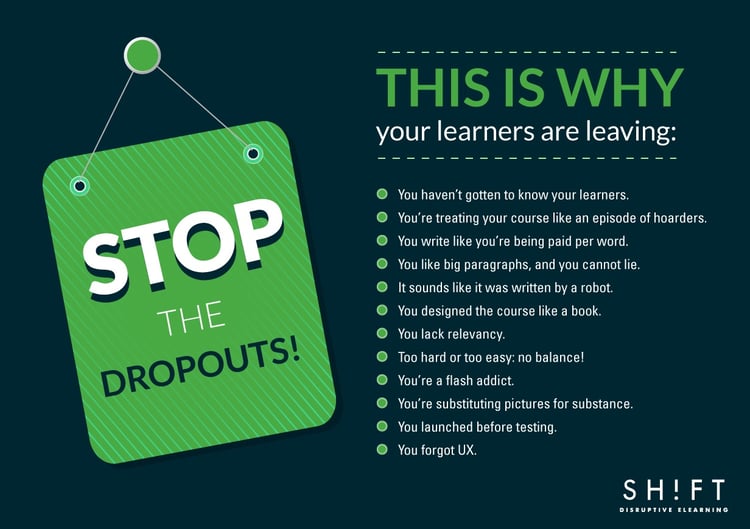
Are workers dropping out your eLearning courses like the proverbial ‘hot potato?’ Are they finding them hard to finish? Giving them bad reviews? Telling everyone they know a crazed monkey designed them? If so, it’s likely your courses have one or more of the following issues that have driven your learners away:

1) You Haven’t Gotten to Know Your Learners
How can you design an eLearning course for an audience you haven’t bothered to get to know? Knowing what they expect, want and need should be your first step to creating a course and it will help give you a better starting place than going into the design blind.
To know your audience, you should find out what they expect to get from the course or training you are designing along with their demographic information like age, location, occupation, skill level, etc.
Here’s why info like that is important and knowing it could potentially you’re your job easier: Let’s say you’re designing a course for Millennials only. It may seem harmless enough to keep in navigation instruction as a “just in case” a learner needs it kind of thing, but this can be a real turn off to this age group. They grew up with technology and basically know how things work or should work so having a lot of instructions will make the course seem like it is of less value and not for them. The one caveat here is that your navigation should be intuitive and should make sense to someone who is used to technology. Conversely, an older group will need more instructions, or they will get frustrated or feel that the course is over their heads.
Additional reads:
- The 5 Best Ways to Research Your eLearning Course Target Audience
- 6 Compelling Reasons Why You Should Know Your Learners Better
2) You’re Treating Your Course Like an Episode of Hoarders
Info is good, but too much info is bad because giving your learners more than one focal point is a pretty good way of making sure they don’t fully see any of them.
The Key: Focus on Objectives. The best way to keep from including too much or going off on only marginally relevant tangents is to keep reminding yourself of the course’s objective. Ask yourself, does this information really bring me closer to the goal? Would this info be better situated as a link or PDF document vs. as part of the general text?
It can be tempting to give your learners ALL the resources, but this is typically more overwhelming than helpful. We know this can be difficult to avoid when you have a lot of info to include, and everyone involved in the project wants certain things included but the course as a whole must come first. It doesn’t matter if Bob from marketing gets six paragraphs about rebranding included in the course if no one bothers to read it or retain it. This is the likely outcome when students are bombarded with irrelevant info and overly full pages: they tune out everything.
Read more: Are You Writing Rockin’ Course Objectives? 7 Do’s and Don’ts
3) You Write Like You’re Being Paid Per Word
Just like not including all the info, you don’t need to include ALL the words. If you can say the same thing in fewer words, do it!
Keep your content focused and moving by keeping it to one idea per page/slide. Shorter sentences and paragraphs are easier to read and skim plus they simply look better on the screen. I could say more, but it seems appropriate to keep this point short ha!
Break your rambling to a minimum with these techniques: 7 Techniques for Reducing Wordiness in Your eLearning Courses
4) You Like Big Paragraphs, and You Cannot Lie
Along with wordiness and clutter, you have to watch out that your paragraphs themselves aren’t that long.
People need to be able to scan your content quickly because that is the nature of how they read online. Use simple language, short-medium length sentences and keep it to 2-3 sentences per paragraph for the most easily scannable content.
5) It Sounds Like it was Written by a Robot
Not all course content is interesting. In fact, most courses probably aren’t particularly thrilling, and this is when you have to try your hardest to make it palatable.
Your learners need something to connect and a sense that an actual human that understands what they need to learn wrote the course. A good example of being informative but bringing personality to the table would be popular Youtube stars who do things like product evaluations.
A 10-minute video on the pros and cons of a new process could be boring, very boring, in fact, but when the right personality type presents it, it suddenly has thousands of views.
Be informative but also be human. Your learners will judge the effectiveness of your course on your content, but also on how interesting, likable and self-assured the presentation is.
6) You Designed the Course like a Book
When you’re tasked with turning a book’s or a presentation's content into an eLearning course, it can be easy and tempting to have simply your learners clicking ‘next’ to get through each page. Even just giving that description is boring, so why would it hold your learners’ attention?
Your learners are capable of doing more than clicking and reading paragraphs so give them more to do! Appeal to their eyes, hearts, minds and even their desire for titillating factoids. Present case studies that show real consequences and have honestly interesting backgrounds. If the wording itself can’t be broken up or spiced up enough, then add visuals.
Basically, why give them a hunk of dry bread like a pack of prisoners who have been sentenced to clicking ‘next’ for the next 45 minutes when you can top that bread with cheese and pepperoni for a virtual pizza party!
7) You Lack Relevancy
We have all had classes that we sat through thinking, “when the heck am I going to use this in real life?” Don’t design that course!
People learn the best when they can relate to a course, and they relate when they clearly see why they need the course. This is why you need to tell them right in the beginning what benefits it has to them. What will they know by the end of the course? How will this help them? What new skills will they have?
Let them know consequences of not knowing: Statistics about how many employees have been jailed for harassment is somewhat compelling, however using a scenario with details can be even more useful in getting a point across. For example, let them know about Karen from R&D at X company had to pay $75,000 in court costs and fines to fight charges against her.
8) Too Hard or Too Easy: No balance!
Don’t alienate your audience by making things too difficult or easy. Easy is boring and difficult is frustrating.
To avoid this, you should pair your audience’s abilities with the subject matter. Give them a survey before the course is designed or provide them a mini-course or document explaining the background to make sure everyone has a certain level of base knowledge. This will save you time and give those with less experience a chance to catch up while more advanced learners won’t have to sit through a more drawn out sequence.
9) You’re a Flash Addict.
Yes, flash pages are pretty. Yes, they are fancy. Colorful. High-tech looking. You know what else they are? ANNOYING! They complicate the access to your eLearning course and also make it difficult, if not impossible to view on certain devices.
Your users want accessibility more than they want super cool animations because those animations likely mean they can’t use their preferred mobile devices.
Focus on making your course easy to use on as many devices as possible and you will have put your time to far better use than if you had created a bunch of flash pages.
10) You’re Substituting Pictures for Substance
If you find yourself adding photos to a slide because it ‘looks cool,’ because you ‘like it’ or for any other reason than it is beneficial to the course then you are incorrectly using visuals.
Evaluate your images and ask if they really add to the course or if you are just trying to pretty up the page. If you’re just using them as a nice visual, then it’s likely they are just going to be distracting to your audience and make your course look amateurish.
Similarly, using disjointed image styles can also be distracting. Make sure your graphics look like they go together especially when you are somehow illustrating a scenario. Your characters should look consistent throughout the scenario and the entire course.
The visuals you do use should either help to reinforce the text or invoke some emotion. Does your picture produce an emotional response, even if it is a bad one? If so, it is likely to be more memorable and has a better effect on your learners’ retention.
11) You Launched Before Testing
You’ve seen your course from the designer’s perspective but to make sure it really works; you need to see it from the learner’s point of view. This means testing the course before you officially get it into students’ hands.
Run through your course just as if you were a student. Let others run through it. Does it work on all devices? Do the questions make sense? Are all the links, buttons, and other interactive bits in working order?
12) You forgot UX
If your course looks nice but the user experience is bad, then your course is bad. It’s that simple.
It really doesn’t matter if your visuals are eye-catching and your font choices brilliant if your users can’t find the ‘Next’ button. This is, once again, why testing is so important.
Your eLearning course should be easy to move through and won’t anger your audience who is likely made up of people who know their way around a computer pretty well. Make it intuitive and useful and they’ll be happy and so will you.


