 The Power of White Space to Improve Screen Design in eLearning">
When you began to plan your course, you probably never thought of one aspect of eLearning design: the effects of white space. In fact, it’s one of the most overlooked elements in the screen layout of a course. It’s actually a very important component of design. Effective eLearning designs are made by appropiate use of white space, and plenty of it.
What Exactly is White Space?
It’s sometimes called negative or blank space too. That’s space that appears between elements in any composition. Most of us refer to it as a part of the page or screen that remains blank. It’s space that appears between figures, type or columns. In short, white space is area intentionally left untouched.
Its inclusion as part of an effective eLearning design can turn a screen into something very interesting or sophisticated, or both. White space reminds us that simple screen designs can be highly effective and that it’s unnecessary to cram a screen with text and graphics to get a message across.
Why Should You Develop an Eye for White Space?
Short answer: It’s the #1 way to make your course both readable and attractive to learners. An abundance of white space in the right locations on a screen is crucial to build eLearning courses that deliver.There are no set design rules of formulas for creating the right amount. You should consider successful course designs to determine why they work well. Then experiment a bit. Eventually, you’ll get the feel of how to maximize this important design element. You’ll also need to change the design mix from one course to another.
Using white space correctly allows you to control the learning experience. As an element of effective eLearning design, it’s often the item that keeps learners motivated to continue. It makes your course easy on the eyes so that learners can more readily absorb and process information. It can virtually transform a design.
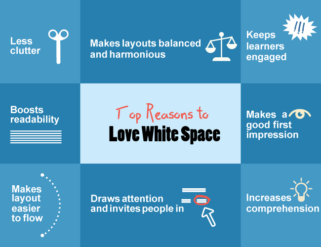
Top Reasons to Love White Space
There are many positive effects of white space to keep in mind as you build eLearning courses. Here are eight of the most important:
1) Simple layouts keep learners engaged.
White space makes looking at your screens a more pleasant experience. Research shows that page layout influences reader satisfaction (Chaperro, Shaikh, and Baker 2005). When it comes to effective eLearning design, layout creates the first impression. With white space, you naturally use simpler designs that draw the reader’s eyes.
2) White space boosts readability and guides readers’ eyes.
It makes it easy to scan and quickly absorb course content. Using it can significantly increase page legibility and readability. Experts say that people read only around 28 percent of words on a Web page. When you place white space between lines of text, your screen instantly becomes more reader-friendly. White space actually leads the reader’s eye around the screen, raising the odds that text will be read.
3) It helps eLearners feel at ease.
Skimp on white space in eLearning design, and learners are likely to feel overwhelmed and even intimidated by the load of information on a screen. White space draws attention to a few major elements, creating a calming effect. Learners aren’t bombarded with confusing choices for reviewing information.
4) White space can increase learner comprehension.
How? By presenting information in chunks that learners find manageable. Inserting white space correctly can cause comprehension to jump by nearly 20 percent.
5) It draws attention.
What could be an easier way to make important screen elements get attention? White space is a great tool for prioritizing course information and avoiding distraction. If you want to make a specific part of the screen stand out, all you have to do is add white space around it. White space around the highlighted items tends to increase their prominence (Olsen, 2002).
6) It makes layouts balanced and harmonious.
Every empty space on a screen serves a purpose. It creates a balanced design for your eLearning content. Leave it out or use it too liberally, and you risk disorganization and learner confusion.
7) Reduces clutter
Many eLearning designers feel the need to fill the screen with everything they can. But, just because there is space to add something on the screen, doesn't mean they should. Having too many elements on a single screen isn't effective. Therefore, white space ensures every design element on your screen doesn't become jumbled together.
8) Make a great first impression
It only takes a learner three to five seconds to judge the value of an eLearning screen. If there is too much information for users to process in such a short time, learners will probably become confused.
How to Use White Space Effectively in eLearning
So how do you use white space to effectively build eLearning courses? Among the most important ways to make sure it improves your course’s legibility, readability, comprehension and usability are these:
- Use two or three columns with great spacing to showcase the most important information.
- Allow space between images and between paragraphs to focus attention.
- Use proper line spacing for text to boost readability.
- Try incorporating color, pattern and texture.
- Group information using bullets, headings and images.
- Use space between paragraphs and headers for increased readability.
- Axe any pointless graphics.
Also, use white space to help learners organize and structure graphical information effectively. Read this post for examples.
Want to find out more? Check out these references:
Boag, P. (2011 February 15). Why whitespace matters. Headscape & Boagworld.
Kollin, Z. (2013). Myth #28: White space is wasted space.
Using White Space (or Negative Space) in Your Designs
5 Ways How Whitespace Affects The User Experience
Ready to transform your corporate training?
See real results from companies that train with SHIFT — or talk to our team.