Did you know that a whopping 80% of what we process online is visual? Yes, our brains are hardwired to respond to visuals, especially when we're learning. This means that visuals, especially colors, are more than just design choices - they're game-changers in eLearning!
Color isn't just a design choice; it's a dynamic tool that taps into the learner's psychology. Whether it's evoking a certain emotion, drawing attention to key content, or providing a calming backdrop for intensive learning, the strategic use of color can significantly amplify the effectiveness of eLearning materials. But, like any powerful tool, it's crucial to use it judiciously. Overwhelming your learners with a rainbow riot might just lead them down the path of cognitive overload, negating any positive effects.
Before you dive into designing your next eLearning course, take a moment to understand color psychology. Trust us, it's a game-changer. Ready to infuse some color magic into your content? Let’s explore this together!
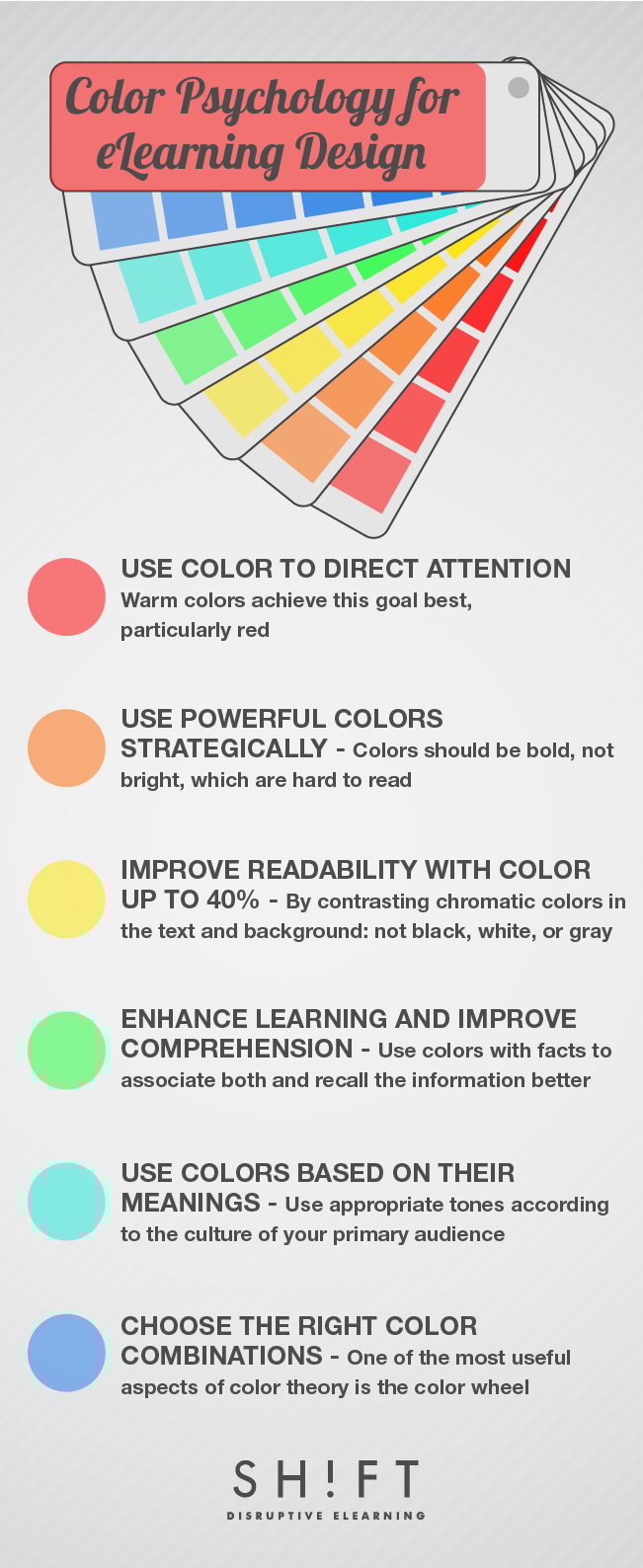
1) Use Color to Direct Attention
Ever noticed how a vibrant red "SALE" sign in a store instantly draws your attention, even from a distance? That's the captivating power of color in action! In the realm of eLearning, this principle is just as effective. Color is a potent tool that can fend off monotony, ensuring learners remain actively engaged, rather than just passively scrolling. Elevated attention is a gateway to enhanced recall rates and swifter reaction times—an invaluable asset for any educational journey.
Multiple research endeavors have underscored this fact: developers who strategically employ colors to highlight specific elements or pieces of content on screen often witness a noticeable uptick in learners' attention. Among the spectrum, warm colors, particularly hues of red, are the prime attention-grabbers. When used judiciously, red doesn't just catch the eye—it also stimulates the visual senses, reinforcing memory retention. So, the next time you're crafting eLearning content, remember: a touch of red might just be the key to helping learners anchor vital facts and figures more effectively.
Thinking of applying this tip to your eLearning course design? Here's a practical example: Imagine you're creating a module on workplace safety. To emphasize the importance of certain safety procedures, you could use a bold red icon or sidebar next to the most critical points. This visual cue will not only draw the learner's attention but also reinforce the importance of that specific content, ensuring it sticks in their memory long after the lesson is over.
Also read: Attention-Grabbing eLearning Design: 5 Techniques You Should Try
2) Use Strong Colors Strategically
In the realm of eLearning, the adage "less is more" often rings true, especially when it comes to employing bright and bold colors. While these vivid hues can be captivating, they can also be a double-edged sword. Used without restraint, they risk creating a visual cacophony, pulling the learner's gaze in all directions and diluting the very emphasis they were meant to create.
So, what's the golden rule here? eLearning designers should opt for bold, solid colors over their brighter counterparts and should steer clear of neon shades that can come off as unprofessional. Moreover, these strong colors achieve the best impact when set against neutral backgrounds. This contrast not only highlights the key content but also ensures readability and professional aesthetics.
Need a tangible example? Let's say you're designing an eLearning module on data privacy. You might use a solid, bold blue to emphasize key legal terms or obligations, placing them against a soft gray background. This approach ensures that learners' attention is immediately drawn to these critical terms, without overwhelming them or making the content challenging to read. Such strategic use of color not only elevates the design but also enhances the overall learning experience.
3) Improve Readability with Color
When it comes to eLearning, color isn't just about aesthetics. It's a powerful tool for enhancing comprehension, aiding retention, and most crucially, improving readability. In fact, the strategic deployment of color can uplift the clarity of your text by a substantial 40%. How so?
First off, by weaving color methodically across every screen, developers don't just make the visuals pop. They also present concepts in a more coherent manner, facilitating logical reasoning and cementing memory. It's a way of underlining key ideas and making them more digestible.
But that's just half the equation. The real magic happens when color boosts the very readability of the content. By pairing contrasting chromatic hues for the text and background, the content instantly becomes more legible. Not sure how to find these contrasting colors? A color wheel can be your best companion here.
To add a bit more depth, consider insights from the Branding Strategy Insider:
-
Black on yellow and green on white are among the top legible color combinations, with red on white not far behind.
-
On paper or digital screens, the classic black on white remains unmatched in terms of ease of reading.
-
Warm, hard colors like red, orange, and yellow are not just more visible, but they also create the illusion of objects being larger and nearer, making them inherently more engaging.
-
On the flip side, cool, soft colors like violet, blue, and green appear subdued, making objects seem distant and a tad trickier to focus on.
Putting it into Practice: Imagine you're crafting an eLearning course on digital marketing strategies. To emphasize statistics and data points, you might opt for black text against a soft yellow background, ensuring the numbers stand out and are easy on the eyes. Meanwhile, for definitions or key terms, a green text against a white backdrop could be effective. These intentional color choices don't just elevate the design but significantly enrich the learner's experience, making complex information more accessible.
Recommended read: The Complete Guide to Choosing A Color Palette For Your eLearning Course
4) Enhance Learning and Improve Comprehension
In the kaleidoscope of human learning, color emerges as a potent ally. Ever wondered why colored visuals seem to linger in memory, while monochromatic ones fade quicker? It's more than mere aesthetics; it's science.
Our brain is intrinsically wired to associate and remember colors. Color ignites specific neuropathways, making the retention of colored visuals more robust than mere verbal or textual cues. The Institute for Color Research, now known as Color Matters, unveiled some eye-opening insights. According to their studies, color can amplify learning by a margin ranging from 55% to a staggering 78%. Moreover, comprehension rates can shoot up by an impressive 73% when color is strategically employed. Corroborating this, multiple studies have underscored that colored images overwhelmingly outperform black and white counterparts in terms of recall. Specifically, the majority of participants could recollect a higher number of colored images compared to monochromatic ones.
With such compelling data at hand, eLearning developers have a golden opportunity. By infusing courses with intentional color schemes, they can supercharge learning experiences. Think color coding, for instance. Imagine setting a deep blue backdrop for screens detailing vital concepts. Over time, learners will subconsciously associate that blue with essential facts, aiding quicker recall during assessments. This technique becomes especially invaluable for complex or highly technical subjects. By segmenting information with distinct color palettes, developers can create mnemonic aids, guiding learners through intricate topics with ease.
Practical Implementation: Crafting a module on cybersecurity? Use a specific color—say, teal—for sections on threats and vulnerabilities. Contrast that with a rich amber for best practices. As learners navigate the course, they'll begin to link these colors with their respective sections, streamlining both understanding and recall. This strategy is more than just a visual treat; it's a powerful pedagogical tool.
Also read: The Psychology of Color: How Do Colors Influence Learning?
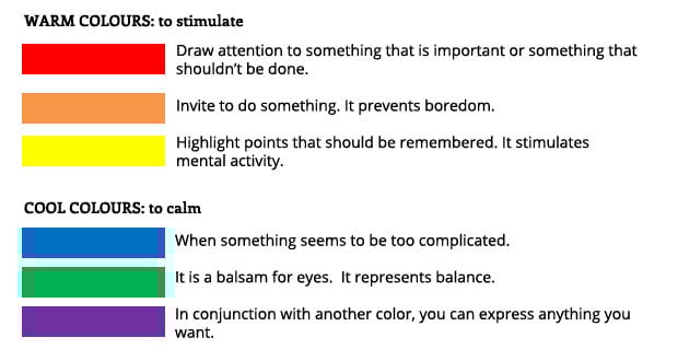
5) Use Colors Based on Their Meanings
Every color whispers a story, and even if you're skeptical, it's likely your learners are absorbing these tales. Color psychology is universal, although the stories may change across cultures. Recognizing these cultural connotations is crucial for eLearning designers to enhance comprehension and engagement.
For instance, in Western cultures:
- Red often indicates urgency or errors.
- Black denotes seriousness or negativity.
- White embodies purity or simplicity.
- Blue is calming and is associated with openness and creativity.
- Green is reminiscent of nature and peace.
Beyond cultural contexts, academic environments also have their color associations. Remember red marks on an incorrect answer? But then there's the calming blue feedback on an open discussion topic.
A fascinating study by Mehta & Zhu from the Sauder School of Business underscores the impact of color on cognitive tasks. Red can heighten performance for detail-oriented tasks, while blue fosters creativity. That said, continuous exposure to red might hamper prolonged concentration.
Designers can tap into these color meanings to craft the learning mood. Want a high-energy module? Opt for shades of red, orange, or yellow. For a serene and focused environment, cool blues and greens are your go-to.
Putting It Into Action: Suppose you're designing a course on innovative thinking. Utilize shades of blue for brainstorming sections to ignite creativity. But when you're presenting intricate data or crucial details, a subtle red highlight can guide learners to pay extra attention. By understanding the subtle whispers of each color, you're setting your course up for a more intuitive, engaging, and effective learning experience.
This post by Edynco, clearly explains when should we use each color in learning design:
Also read:
Color Psychology: Use Cool Colors to Set Just the Right Mood for Learning
Color Psychology: Use Warm Hues to Energize Your eLearning
6) Choose the Right Color Combinations
Choosing the right colors isn't just about aesthetics; it's about making your eLearning courses as engaging and easy on the eyes as possible. While it's tempting to pick hues based on personal preferences, it's essential to ground your choices in color theory, especially if you're not a seasoned designer.
Enter the color wheel: a visual tool displaying colors in a circle, making it easy to spot harmonious combinations. Here's a simplified breakdown:
- The wheel has six primary colors: red, yellow, green, blue, orange, and purple.
- Colors opposite each other (complementary) or those forming a triangle (triadic) guarantee a pleasing combination.
For eLearning, a three-tone color scheme works wonders, striking a balance between variety and cohesion. Using the triadic approach from the color wheel ensures a harmonious palette.
And a pro-tip? Embrace the 60-30-10 rule. This means selecting a dominant color (60%), a secondary color (30%), and an accent color (10%) for a balanced design.
Quick Action: If you're creating a course on environmental sciences, for instance, consider using green (60%) to evoke nature, blue (30%) for water elements, and a touch of yellow (10%) as an accent for energy and optimism. This color scheme is not only harmonious but also thematic, ensuring students remain engaged. Always remember, your color choices play a pivotal role in setting the tone and mood of your course.
You can also use this Color ‘Wheel of Emotions’ as a guide to choose the colors of your course.
In the vast realm of eLearning, the nuances of color go beyond mere decoration. Colors are the silent narrators that influence learning trajectories, guide cognitive processes, and evoke emotional responses. By strategically wielding this palette, developers have the power to transform digital canvases into masterpieces of engagement and comprehension. As we delve deeper into the future of eLearning, let's not just see colors but understand their profound impact. In this ever-evolving landscape, may our courses not only inform but inspire, and may our color choices be the brushstrokes that lead to more vivid, memorable learning journeys.
Recommended Resources:
- Online Quiz: Color Theory for Non-Designers
- A Quick Recap on Color Theory (1-min video)
- Color Theory: Quick Reference Sheet for Designers
- How colors can enhance memory performance?
- Maping Emotion to Color
- Tutorial: Understanding how color affects readability